Platform
Progressive Web Application
Role
UX / UI Design
Company
uVolunteer
Year
2018-19
The Volunteer
Directory
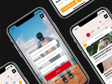
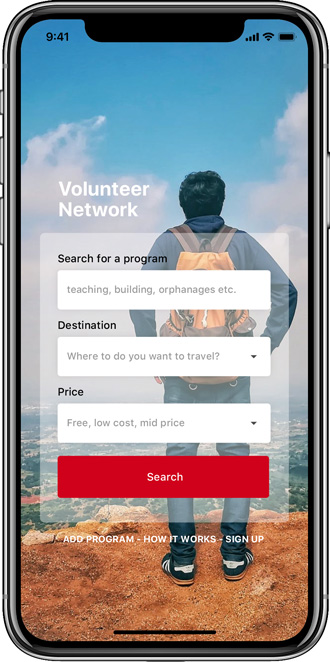
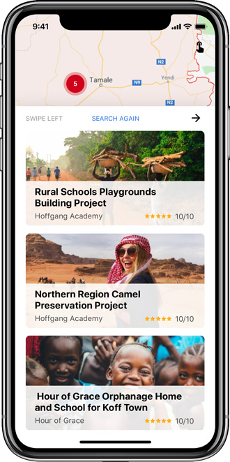
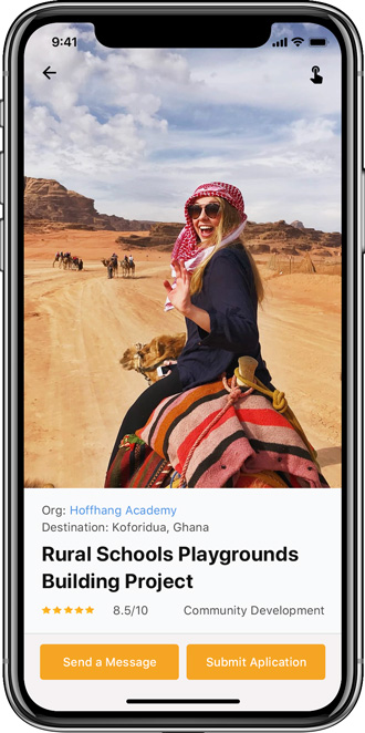
The Volunteer Directory enables local institutions, NGOs and community organizations in the emerging world to connect and recruit volunteers for placements abroad.
Background
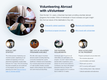
uVolunteer offers volunteer abroad programs in three destinations - Costa Rica, Ghana and Thailand. Recently the organization has been receiving numerous partnership requests from local organizations around the world asking to list their volunteer placements on the uVolunteer website. uVolunteer only features its own managed placements and fears dilution of their brand by listing other organization’s programs on their website.
Given the increasing demand, uVolunteer decided that instead of adding many untested programs to its offerings, it will create a directory (a two-sided marketplace) to enable these organizations to offer their programs directly to uVolunteer clients, but on a platform apart from its main website.
I was tasked with creating the first iteration of a marketplace to enable volunteers to communicate, apply and book placements abroad directly with local program providers.
I single-handedly managed the project from the initial brief up until handoff to the development team and key stakeholders.
RESEARCH
Understanding the landscape
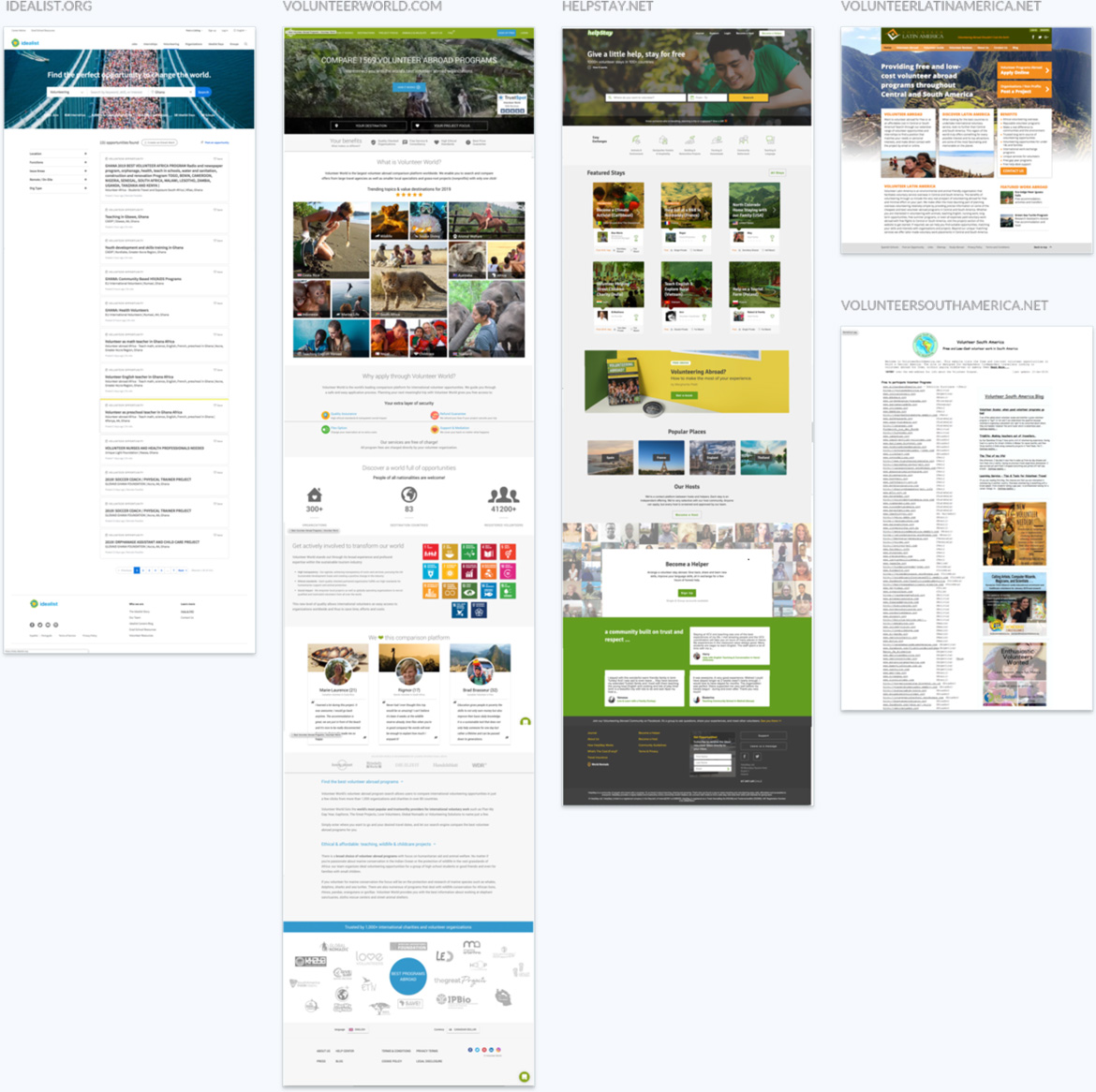
I began this project by exploring two-sided marketplaces in general. Then to further focus my attention on the target market I conducted a competitive analysis of industry aggregators. This research enabled me to collect data to inform design, assess the strengths and weaknesses of the competition, gain insights and extract what I thought were pain points or missing features of the available solutions being offered in the marketplace.
I observed that a few organizations were targeting this vertical, but there was not a platform where only local organizations could list programs. This observation further confirmed our decision that there was a need for such a directory.
Early insights
Having worked in the industry for several years, I considered myself very knowledgeable about the product space. However, competitive analysis, content audit and observations from the initial research were critical in helping me form several solution-focused questions.
Q1. Who was the primary user?
A: Participants
B: Organizations
Q2. How to build a product for two users who use the internet with different types of devices?
Participants: High tech, high-end mobile devices and laptops.
Organizations: Low tech, low price level cellular devices, secondhand and 10+ years old PCs.
Q3. How to build a product that is technologically suitable for both user types?
Suggestions:
- Consider a mobile-first approach, desktop secondary.
- Design to work on lowest spec devices, old secondhand and low-end mobile devices.
- Possibly web app instead of a mobile app.
Q4. Connectivity
Participants:
- High-speed cellular data and wifi connectivity.
- Broadband access in most homes and institutions.
Organizations:
- Expensive 3G cellular data packages with limited data.
- Internet café online access and frequent power shortages.
- Offline access is important
Q5. How to rank the programs in search results?
How to organize and fairly list programs so that a few organizations do not dominate or monopolise the top level of the directory.
Suggestions:
- Fit as many listings on a page as possible .
- View all search results on one page!!!
- User options to filter search results.
- Bookmark of programs for later review.
Q6. Trust. Why would a participant trust an unknown local organization?
Suggestions:
- The platform could be the mediator for payments, disputes and resolutions.
- Program reviews and reporting of verified past participants.
- Money-back guarantee to participants.
- Would participants prefer to cut out the middleman for a little uncertainty and a much-reduced program fee?
Personas
Personas are great for understanding user goals and motivations. They are a representation of segments of our audience and help us understand the decisions of users and inform product development by focusing on specific behaviour patterns to define the product. They also help align user goals, motivations and aid in mapping interactions to achieve these goals.
Personas are a tool which should reflect real people with real motivations and desires.
I pulled data from client demographics, Facebook page insights and web analytics and combined this data with my extensive knowledge gained through several years of ethnographic field studies and client interviews to create preliminary user personas.
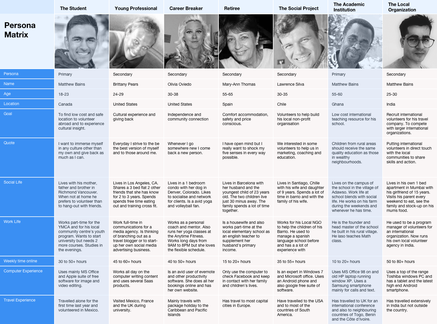
When using personas for product design, as opposed to marketing, I find it best to create a primary personas. I decided on two personas (one for each user type) who, if the product was tailored to, it would also satisfy most of the requirements of the other personas. This choice also made sense for uVolunteer's business and product as the primary personas are key customer segments that the organization had a lot of experience and knowledge of.
Click to view at full size
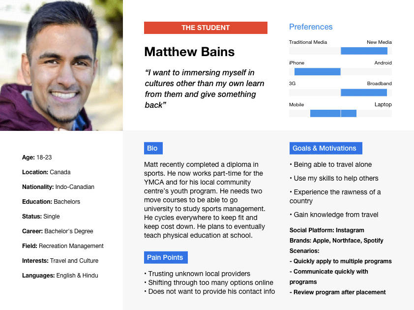
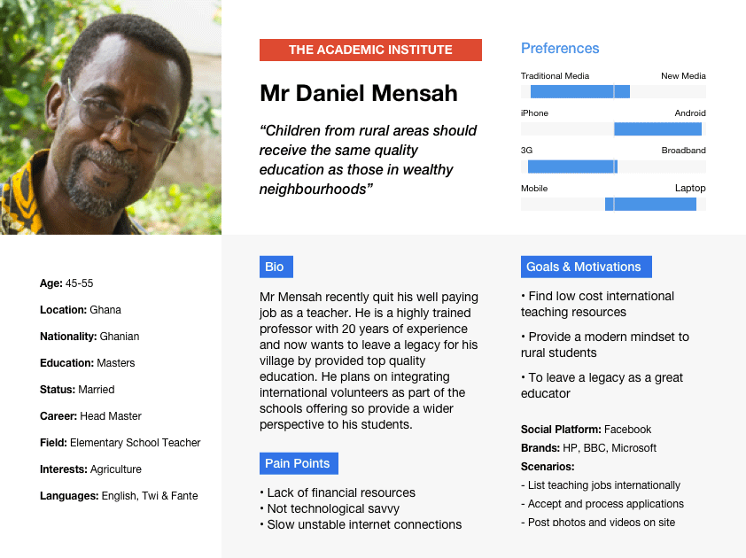
The purpose of personas is to ground the customer journey or content flows on real human traits.
ANGELA OBIAS-TUBAN
DEFINING THE PROBLEM
Use case / User scenarios
Using the primary personas as a guide I created a list of goal-orientated questions and tasks:
What is the product used for?
What circumstances is it used in?
What is the most important functionality?
I find that I can easily clarify such questions by quickly writing out a simple use case. This exercise helps me describe tasks (aligned to the user and business goals) and how the product should behave when the user triggers an action. I try to match the user requirements to a task and then to sequence a step of actions that will illustrate how the user completes the task.
Participants Objectives
- User wants to research volunteer programs (key task)
- User wants to contact an organization (key task)
- User wants to submit an application to be placed on a program
- Business wants the user to review a completed program ASAP.
Organizations Objectives
- User wants to list/promote their programs on the website (key task)
- User wants to communicate directly with interested inquirers responding to messages and applications requests. (key task)
- User wants to encourage positive feedback (review) of ex-participants
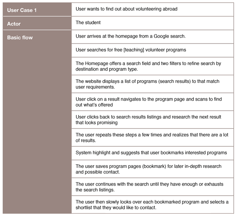
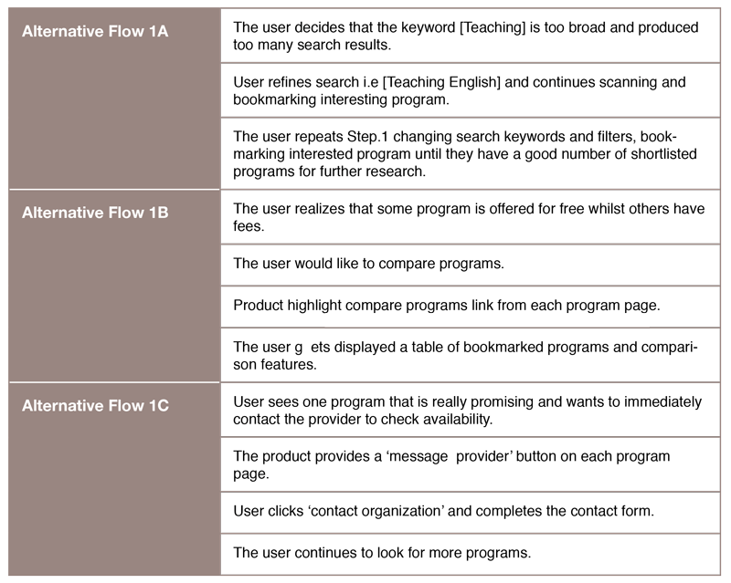
Creating use cases allowed me to quickly highlight the most important goals for each user type.
Refined Key Goals
Participant: Research a program and communicate with the program provider
Organization: Quickly add organization, programs and respond to inquiries
I assumed that once communication between these users was initiated we would then be in a position to see if the two parties would feel comfortable to transacting using the product.
With the key goals defined, I could now start thinking of the journey of the users to achieve their goals.
Customer journey mapping
To capture the use of the product from the users perspective, personas and use cases provide a lens to enable us to get into the heads of the user and map out their journeys. User journey maps are a great tool for visualizing the goals, emotions, questions, and touchpoints of users as they come in contact with the product. A customer journey map can also highlight areas of opportunities to increase the user’s experience.
Click ON EACH MAP to view at full size
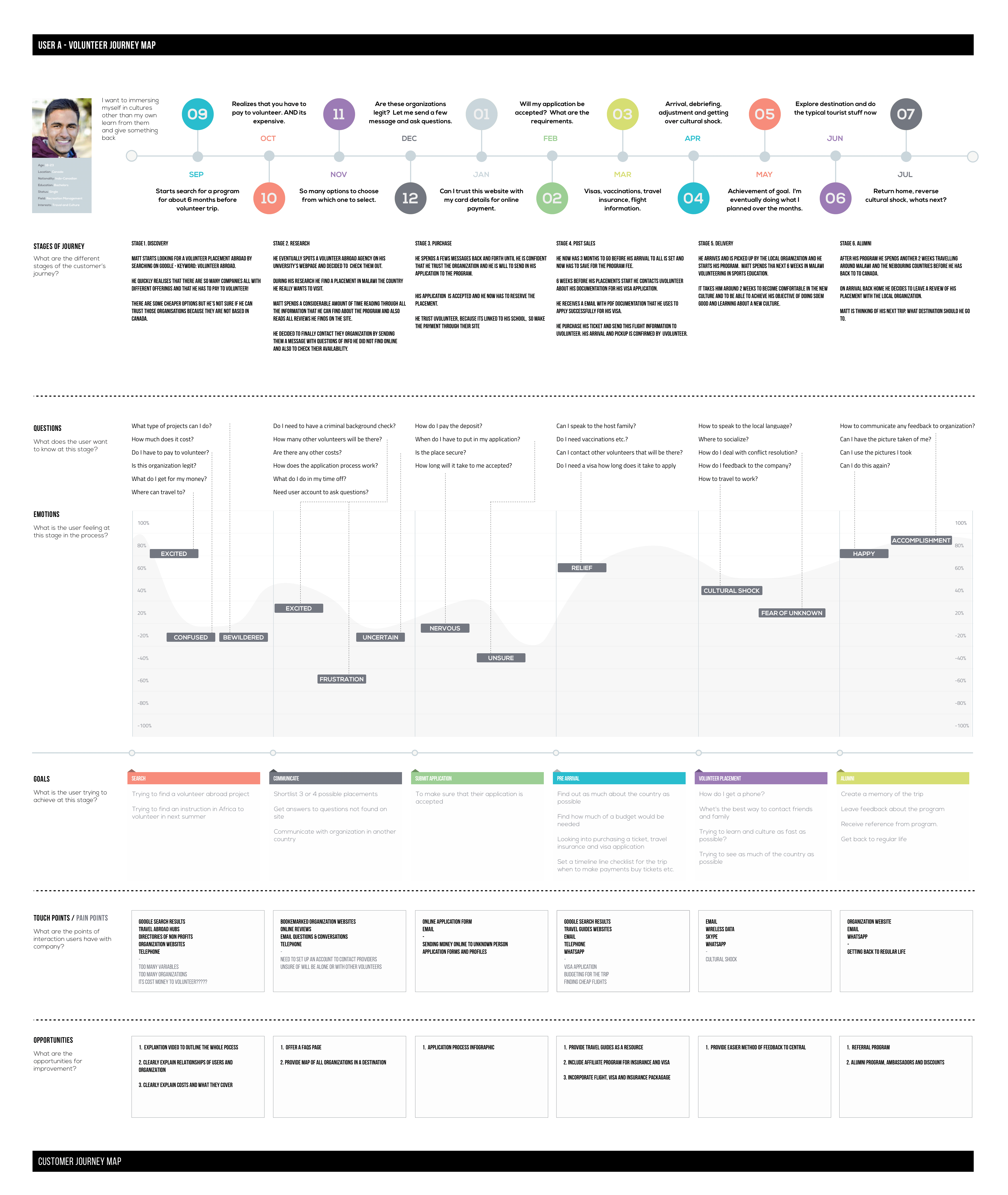
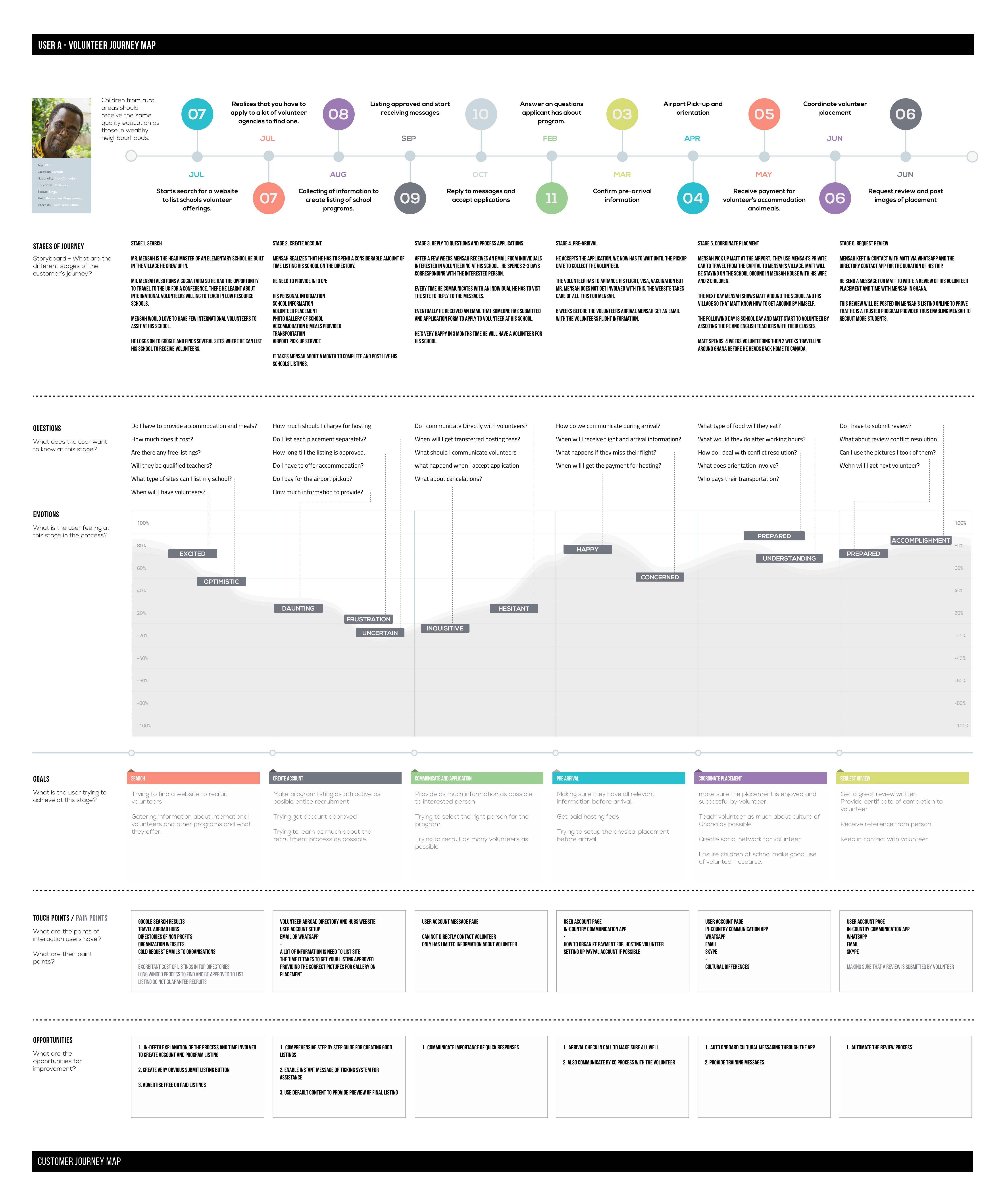
The majority of the time user don’t care about your company, they just want to do one thing.
As a designer, I feel that it's my job to enable users of my products to accomplish what they want to do with as little friction as possible. A CJM outlines the interactions between a user and the product, from the user's point of view.
The data gathered from the user interviews and testing in the research phase of the project was used as the basis of my CJMs.
In my opinion, it is best not to take the CJM as definitive truth until you have walked a real customer through the product and recorded their experiences. However, going through this exercise is useful at this stage, as it helped me understand the customer’s experiences in trying to achieve their goals.
I like to think of personas are a snapshot in time, whereas the CJM shows the journey of the user engaging with a product over a period of time. I find CJM very valuable because they show the journey the user is on and reveal their changing mindset; questions a user might have may change over time whilst using with the product.
INFORMATION ARCHITECTURE
Task analysis
Task analysis is another great tool for information design. This tool helps me quickly turn user goals into user actions.
Participant's Tasks:
1. To find legitimate volunteer abroad opportunities at a reasonable price in a crowded marketplace.
2. To be able to communicate with program providers without giving out their contact information.
3. To apply to programs online and be able to book without compromising their financial or banking information.
4. To be guided through the process from booking to arrival abroad.
5. To learn as much about program inclusions and exclusions, the destination, placement activities, tours and average prices to enable the user to budget for the trip.
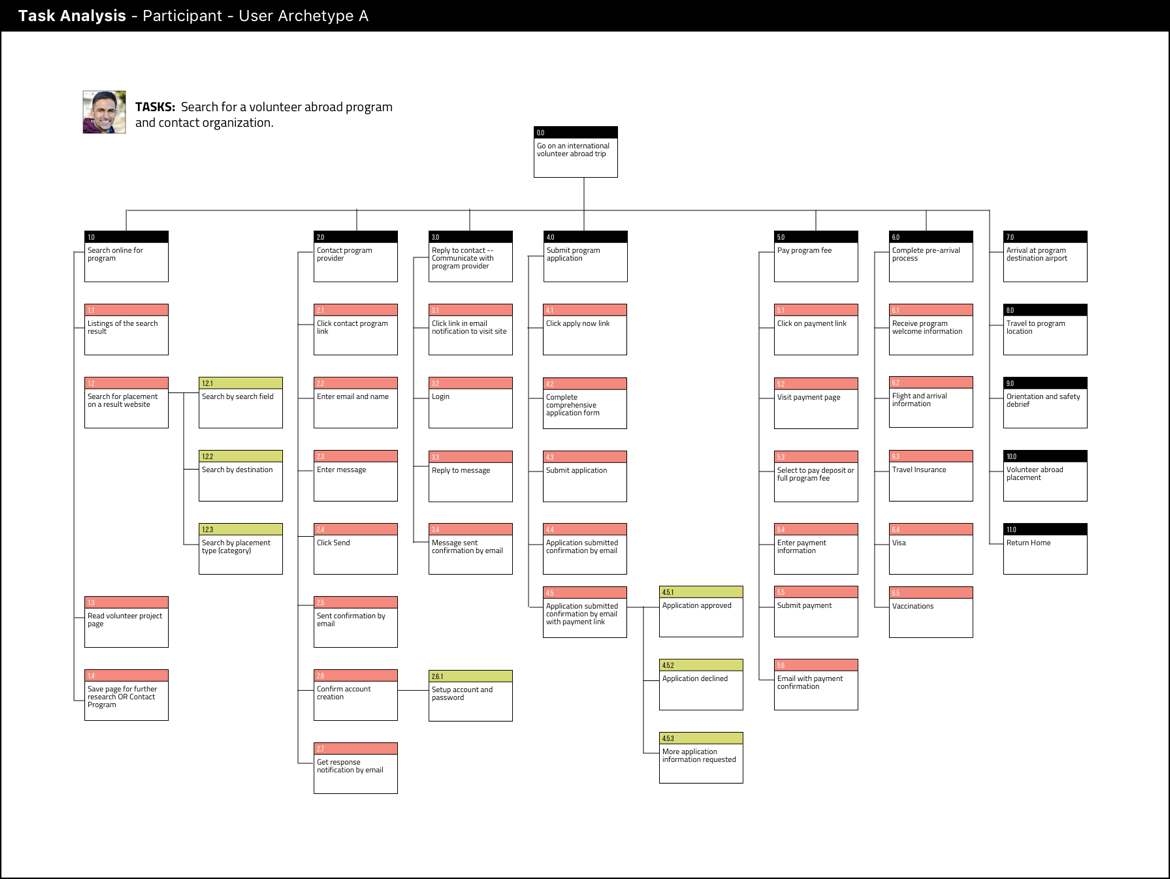
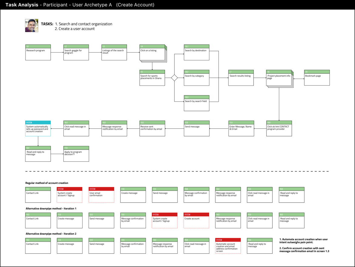
During task analysis, I also diagram any part of the product that was not clear in my mind and that I needed to further clarify.
An example would be — a pain point of one user is register/sign-up. From my user interviews and the customer journey mapping, I learnt that users wanted to use the product to research program abroad but signing up before they can use the site or do things such as bookmarking can be off-putting. I think it's a well-known fact that any area of friction caused by a product increases the possibility of losing the user.
Task analysis makes it easy to spot these areas of friction, quickly iterate and push them further down the pipeline until an opportunity arises where the user has a strong desire to overcome the friction.
I proposed not requiring the user to sign-up there is a response from an organization they contacted because at this moment the user has a strong urge to know the contents of the contact and this should result in a high sign-up rate (if signup is quick and painless). This scenario is only targeted at Participant users because for Organizations users, signing up was a primary need.
This assumption needs to be tested with real users but during task analysis, it is easy to quickly notice and modify functionality to build in such a new feature that may make the user's experience smoother and non-obstructive.
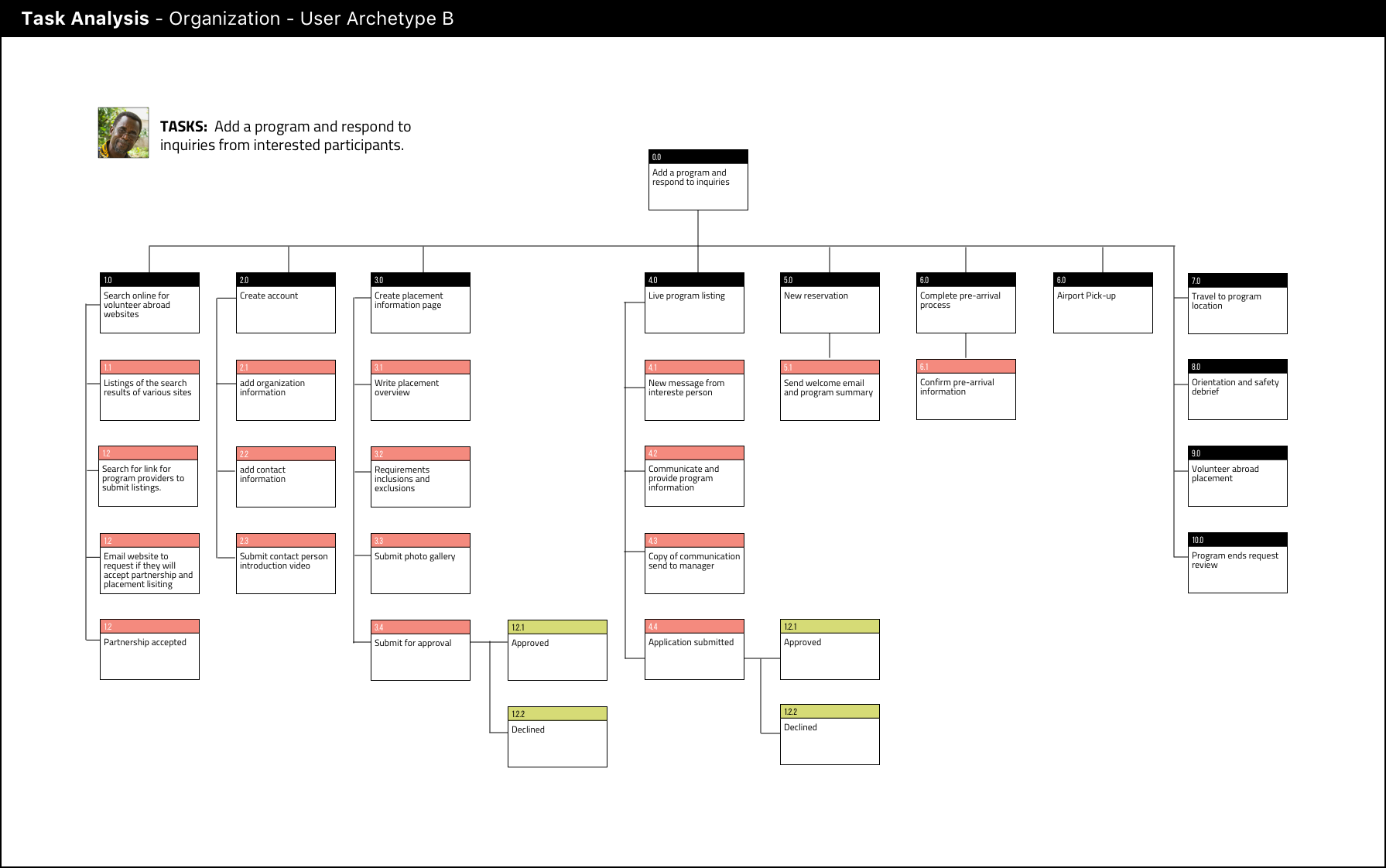
Task Analysis - Organization's Tasks
1. To recruit international volunteers for their institutions,
2. To do so with as little effort as possible,
3. To not pay to recruit volunteers, and
4. To partner with an organization that will take full responsibility for the marketing and recruiting process.
Wireframes
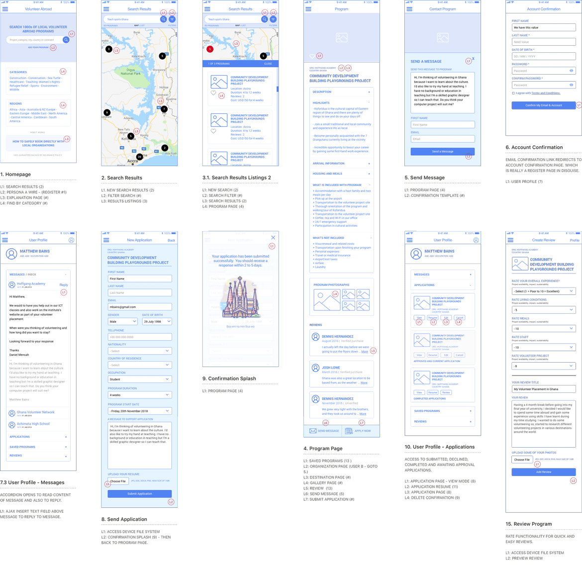
At this stage of the design process, I felt I had a solid mental model of the product to begin the interaction design phase by starting to wireframing.
I knew I was creating a product for both mobile and desktop but both the primary personas are predominantly mobile users. I decided to build a progressive web application with a focus of being used mainly on mobile devices. I would then develop the desktop web application afterwards.
This mobile-first approach would allow me to make sure that the product would work on all low-end devices as well as a full-featured smartphone. As a web application, the product could also employ an offline mode using the service worker of the browser for when there was a drop in connectivity, something that happens frequently with one of our user types.
I had completed a lot of product development in the previous stages of the project that I decided to work at a medium resolution for my wireframe layouts.
Wireframing is by far my most favourite part of the design process. For me, it is where the product starts to come alive.
I find that wireframing is where the design comes together. While creating my wireframes I tend to focus mainly on functionality. I try to work quickly by considering different design patterns for optimum page layout of elements. I iterate on my templates in the same document and try to ensure that the content and functionality are ideally placed on the canvas.
View: Fullsize wireframes for Participants
View: Fullsize wireframes for Organizations
VISUAL DESIGN
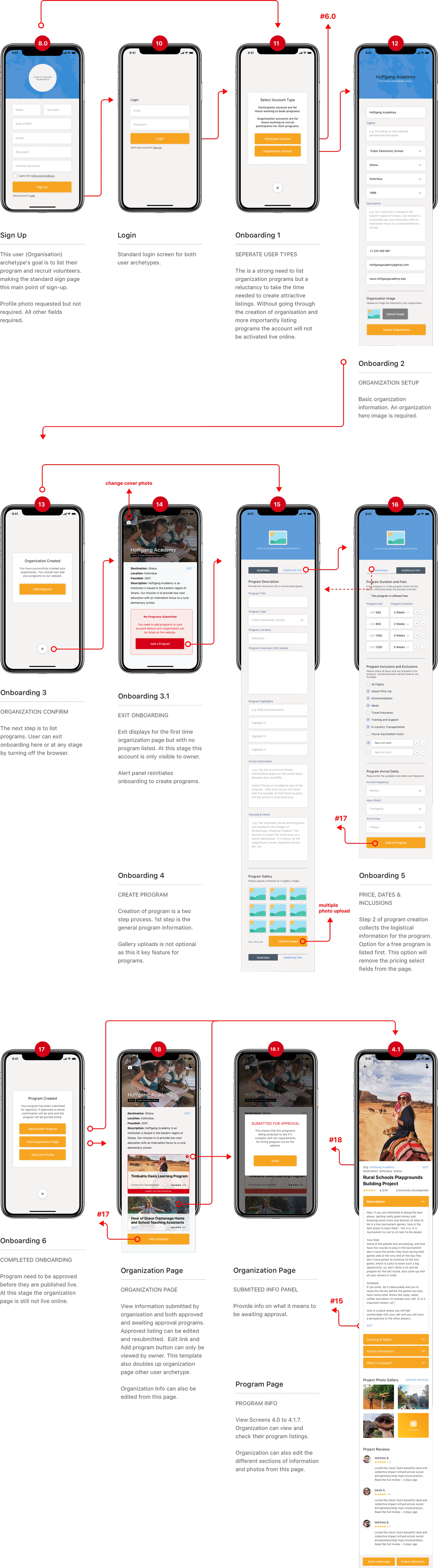
Mock-ups
Ahhh... make pretty stuff, isn't that what designers do!
With interactive product design, I prefer not to treat the visual design stage as the end of the design process. This is because interaction, device, animation and physical context also plays an important part in the finishing of the final product design. So although I produce high-resolution visual mock-ups, I tend to leave these deliverables in a state of flux to be given a final pass after prototyping.
View: Fullsize mockup flow diagram for Participants
View: Fullsize mockup flow diagram for Organizations
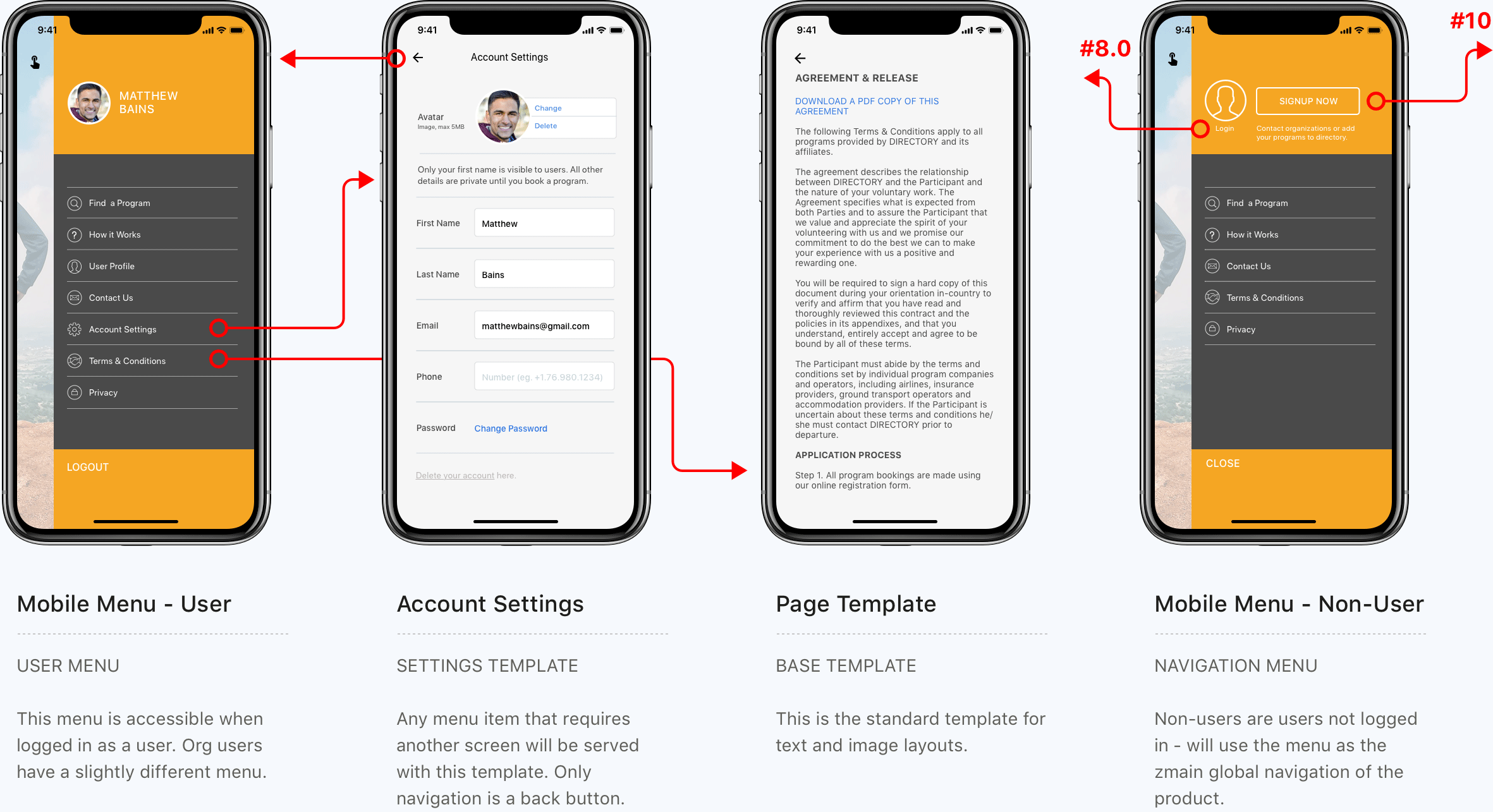
The global navigation
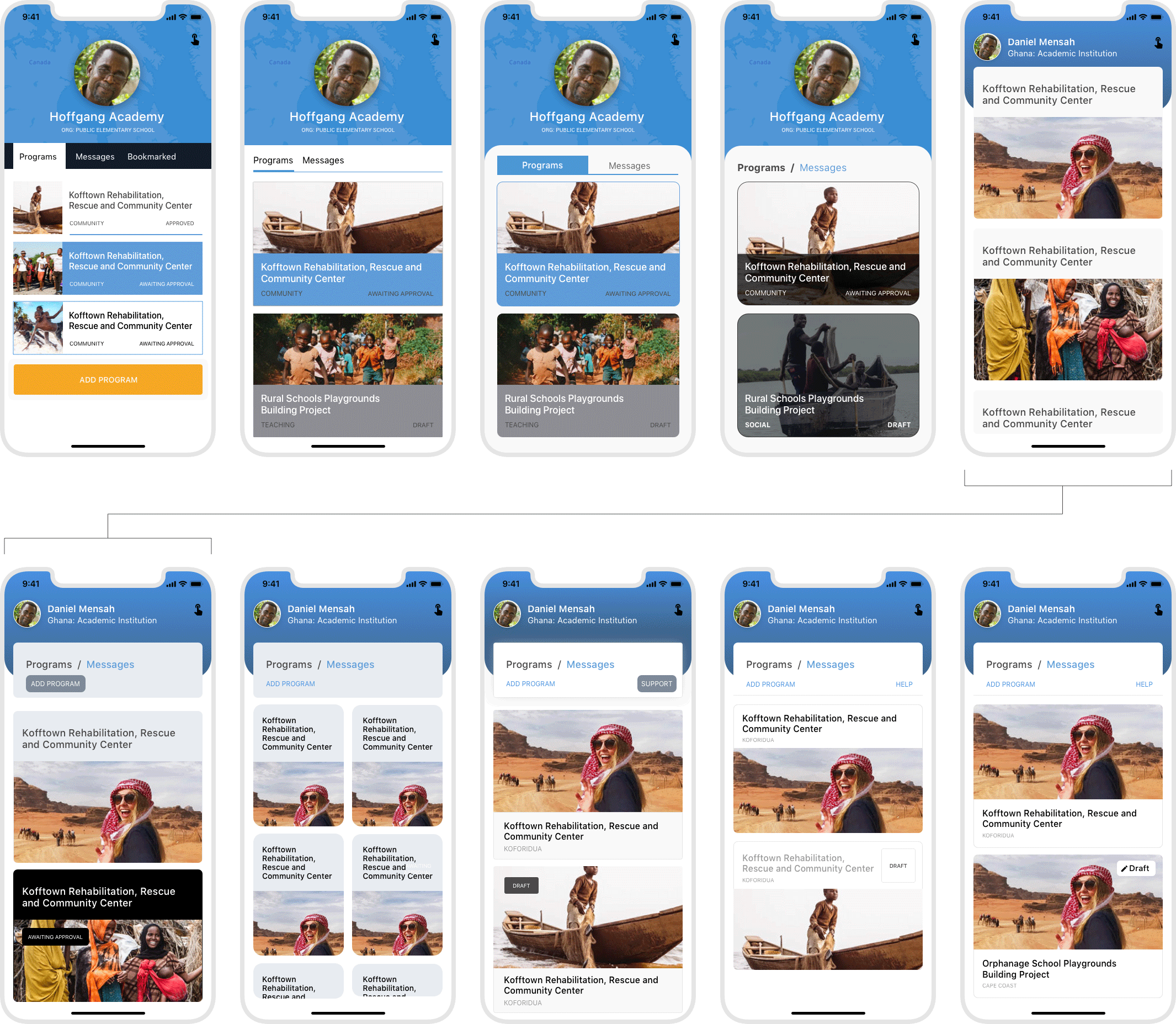
I proposed eliminating the universal top menu bar usually found on most small-screen designs in order to make the interface simpler and clean. I decided to use a 'touch icon' for the global menu icon instead of the regular hamburger menu. What I was trying to do here was to make the design appear more native mobile feeling instead of looking like a website on small screens.
The global menu icon acts as a hub and spoke and is not available on all screens. Specifically, it is not available on screens with card or modal views such as the 'create' or 'edit' screens.
I usually annotate my mockups with functional descriptions for each template. I find this helps with user flow and is also beneficial when presenting work to clients or project stakeholders.
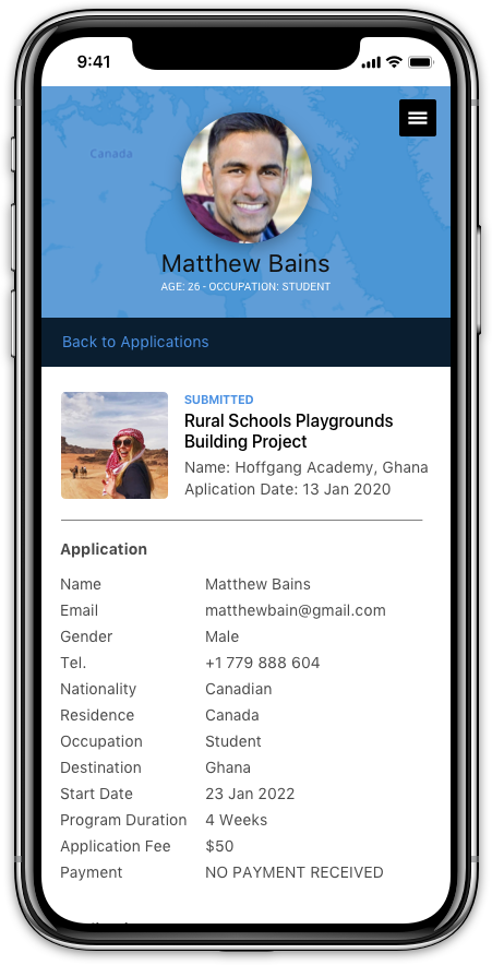
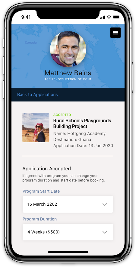
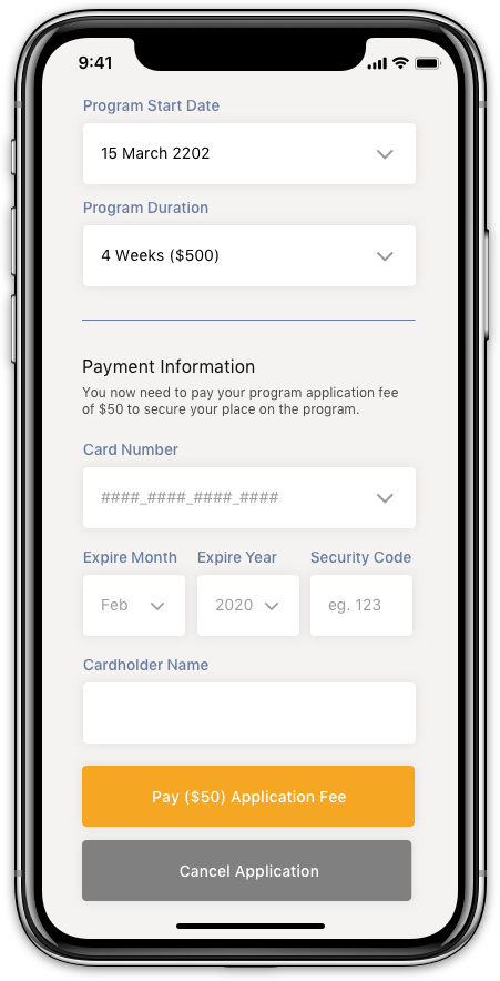
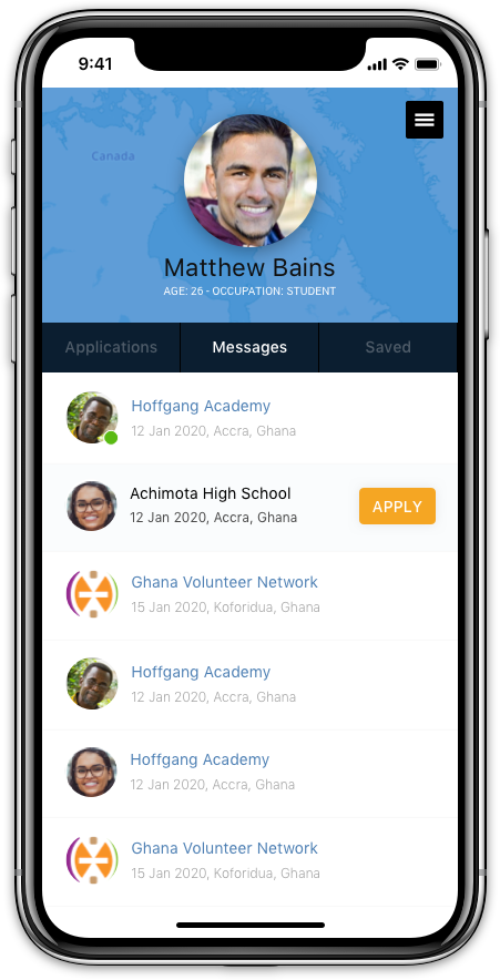
User profile
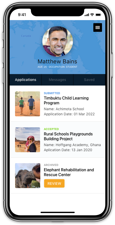
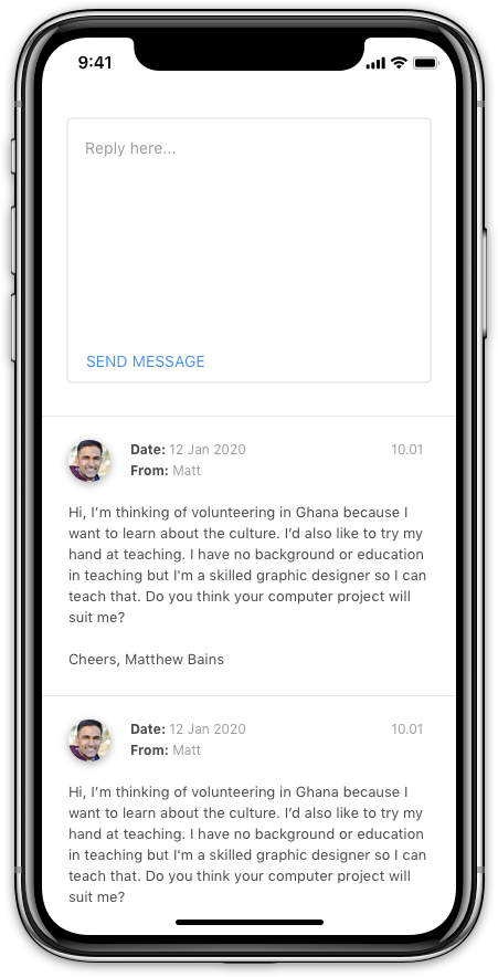
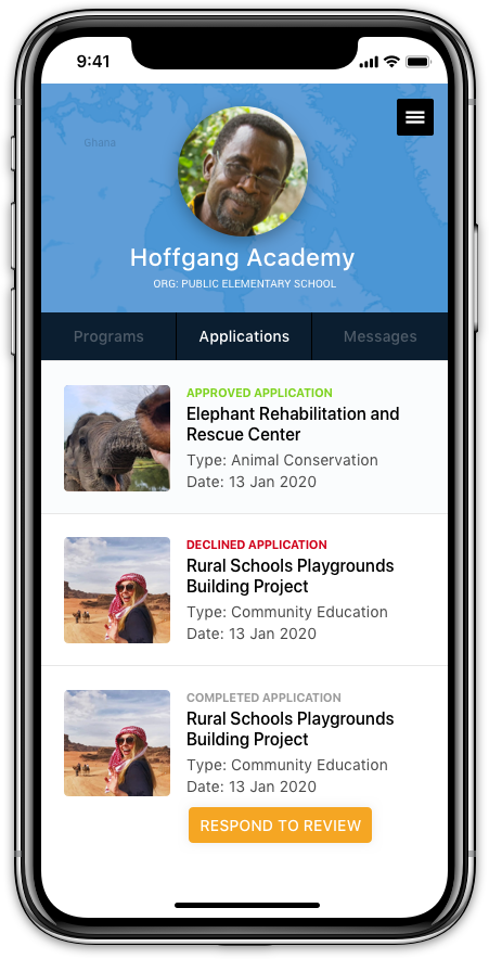
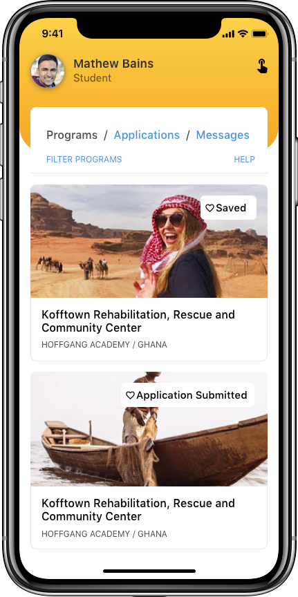
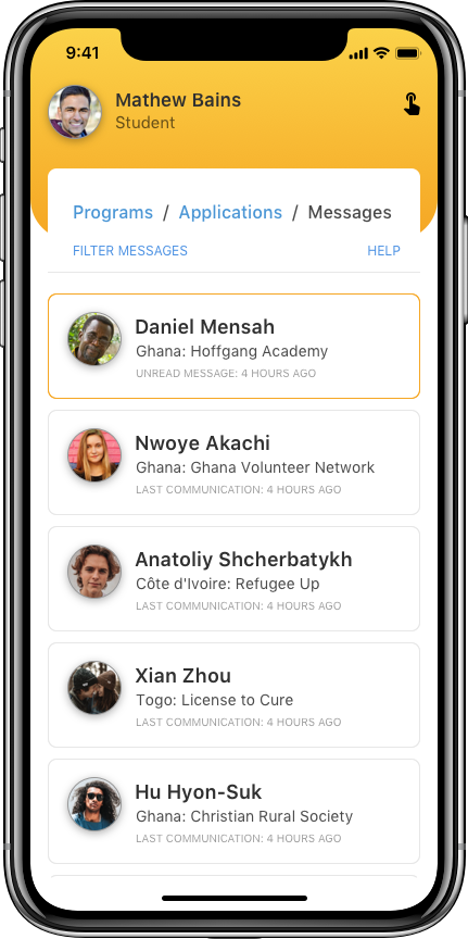
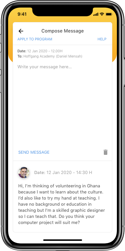
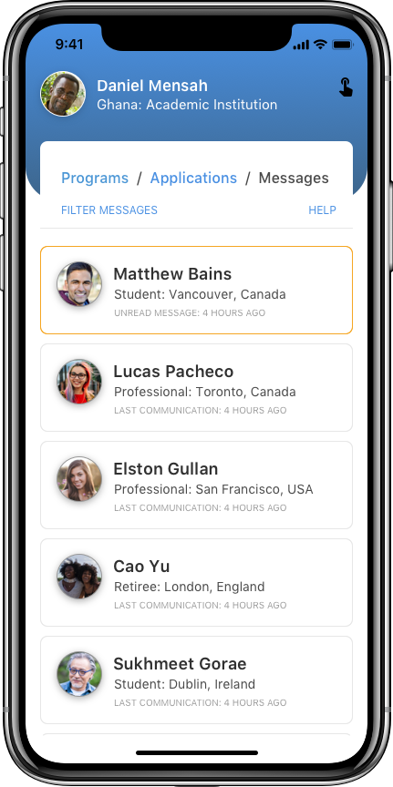
The user profile is the backend section of the app that is only available to logged-in users. This is the space where the two different users types can communicate.
It is also the place where:
User - Participants: Can submit applications, view bookmarked programs, pay for and review programs.
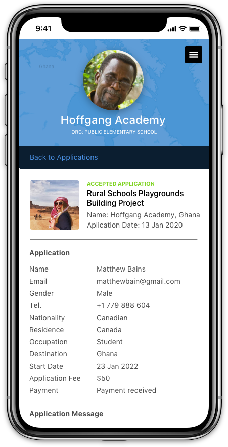
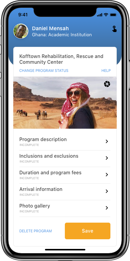
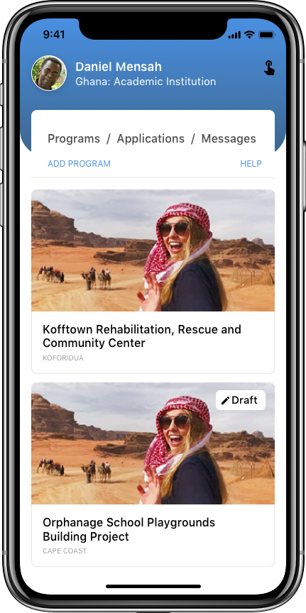
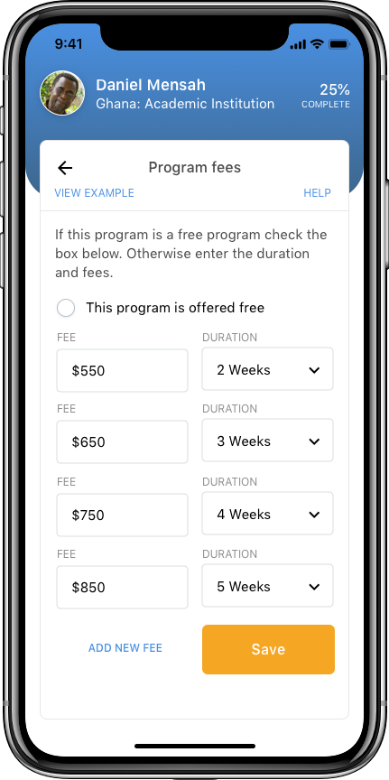
User - Organizations: Can edit organization details, create, edit, delete programs and administer program applications.
The user profile section of the app acts as a unifying dashboard for both user types.
Click ON EACH SCREEN to view at full size
INTERACTION DESIGN
Protoypes
Prototypes are great for demonstrating behaviour and presenting product solutions and decisions to the project team and stakeholders. In my opinion, you should not go into production without building a prototype after producing mockups; well unless you build a production prototype.
A prototype allows us to work on a multidimensional canvas and can provide interaction tests on product devices.
The feedback I pick up from prototyping that I then use to refine my designs can easily be missed if I skip this stage. If the project allows, I would even suggest building a low-res fully functional prototype (with dummy content) to see how the product behaves in real life.
Participant screens: Click to view the online prototype
Organization screens: Click to view the online prototype
Micro-interactions
For this product, because I wanted to imitate a native mobile app experience with a web application. I choose to use FramerX (FX) as my prototyping tool.
FX is a great tool for interaction design, it's still in its early days and can be a bit buggy on top of having a very steep learning curve (for designers having to learn how to code in Typescript and React). But it is a great tool for working with micro-interactions where simple page transitions, provided by other tools, do not convey the interactivity of the design at a lower-level.
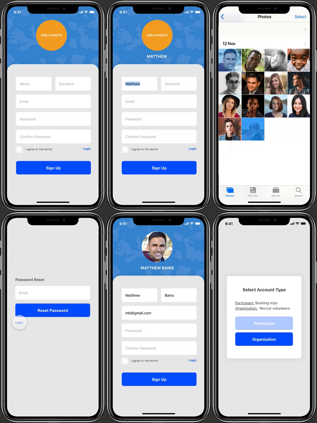
Drag and momentum effects are added to screen elements to produce a native mobile app feel to the web app.
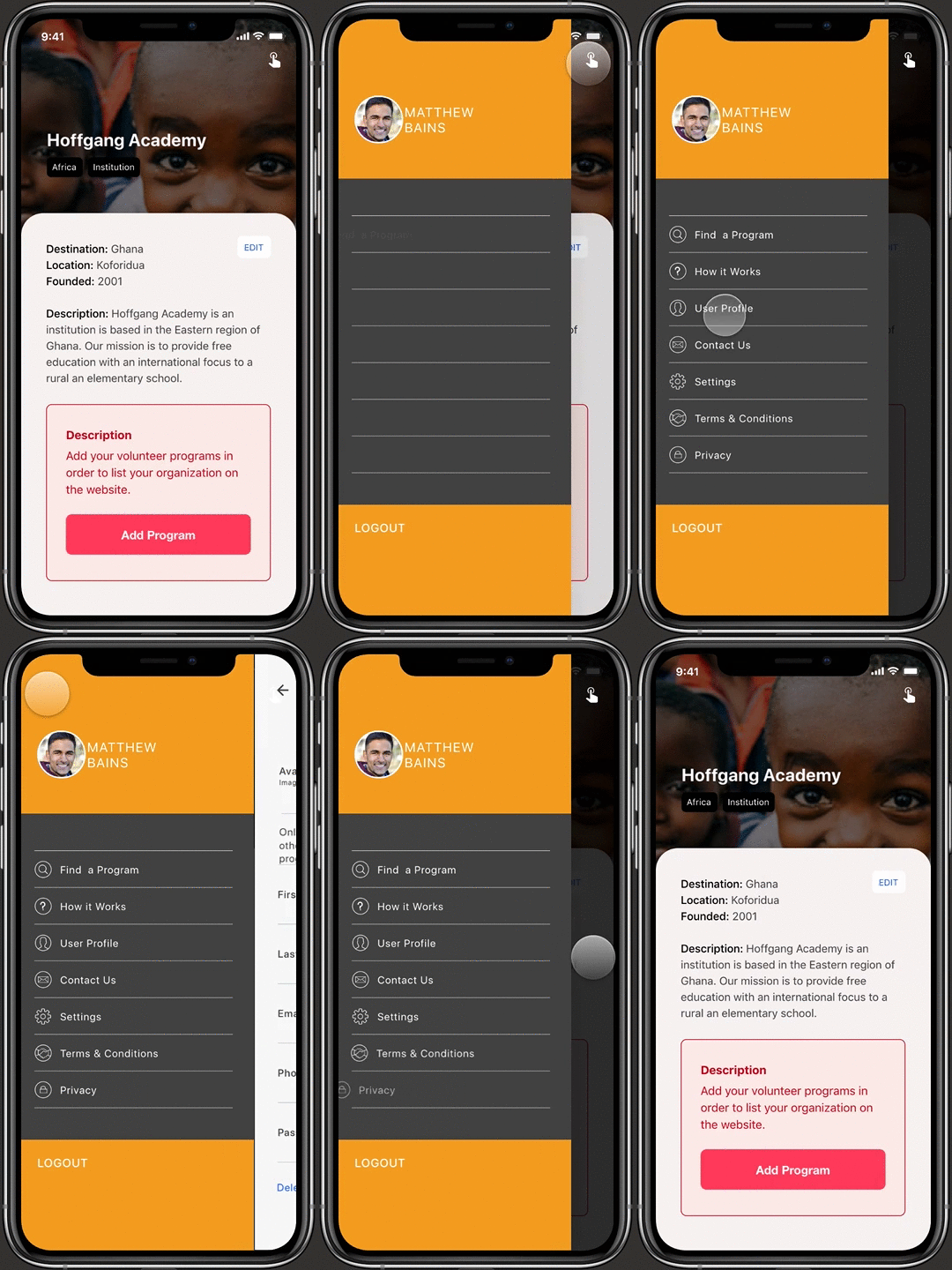
The global navigation is the singular menu of the app. Staggered global menu items further reinforce native app features.
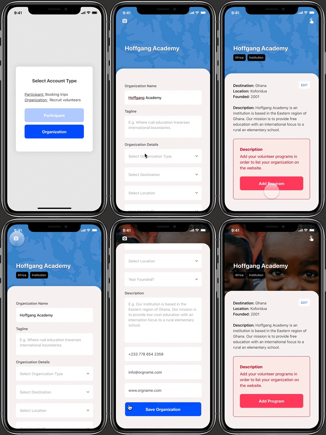
Onboarding screens are seamlessly incorporated into the sign-up process and have to be completed before a listing goes live.
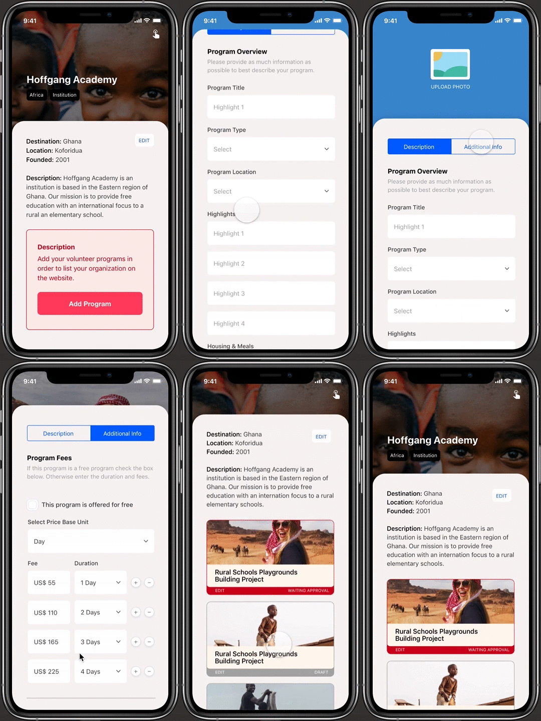
Organizations have a central screen to create, edit and publish all their programs and organization information..
VISUAL DESIGN
Iteration (protoype)
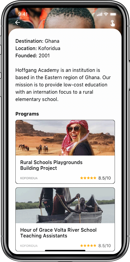
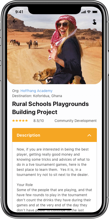
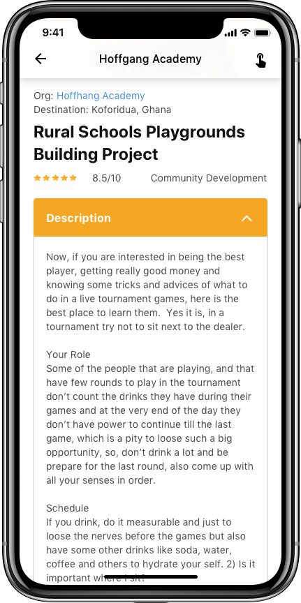
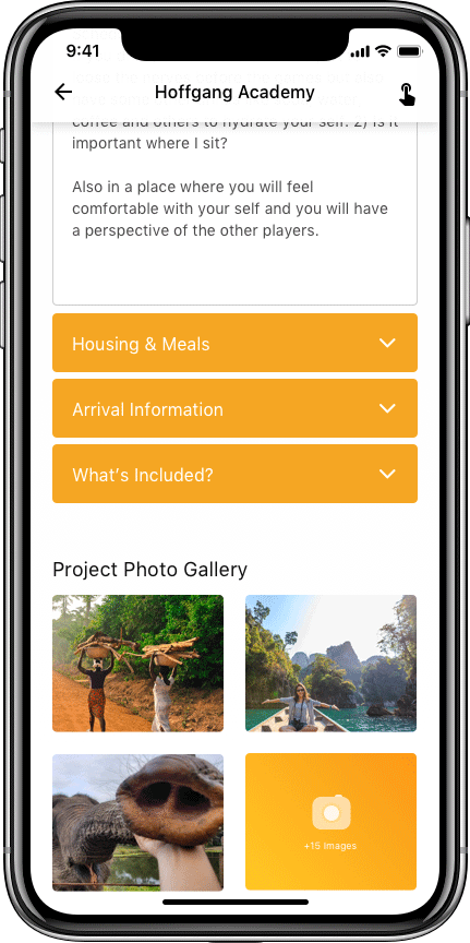
You may have noticed that the visual designs of the prototypes are slightly different from the visual mock-ups created earlier. This is because during the prototyping period I gained a lot of insights by testing the design on mobile devices and, as a result, I made changes to the layout and visual designs of the product as I continued working on the prototype.
When this happens, I usually jump back and iterate through my mock-ups and then I try out some of these new layouts by creating more prototypes. I repeat this cycle several times until I am satisfied with the end product.
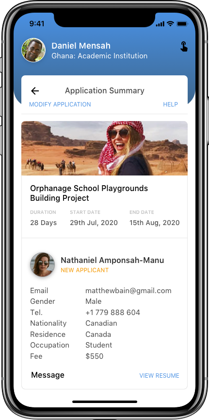
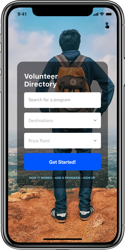
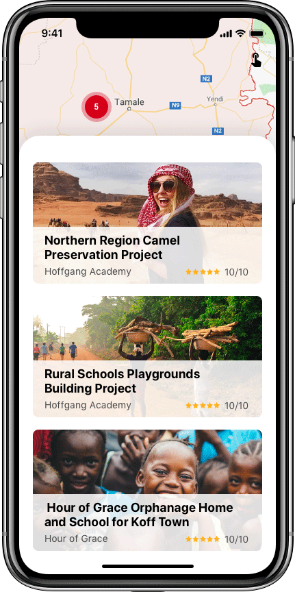
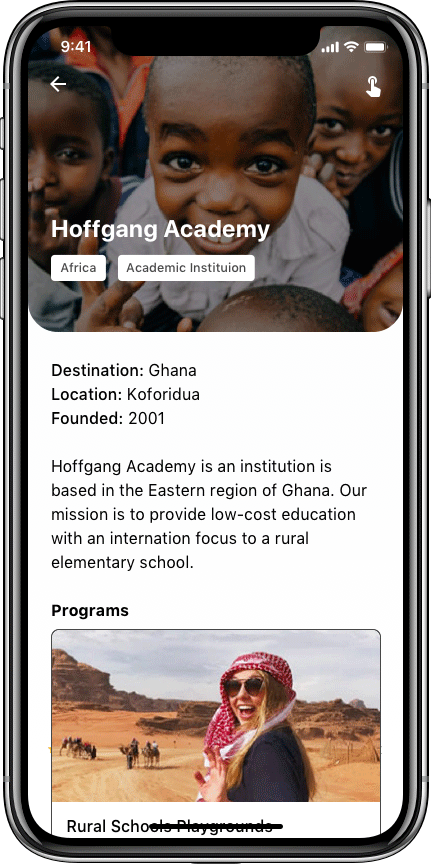
Final templates
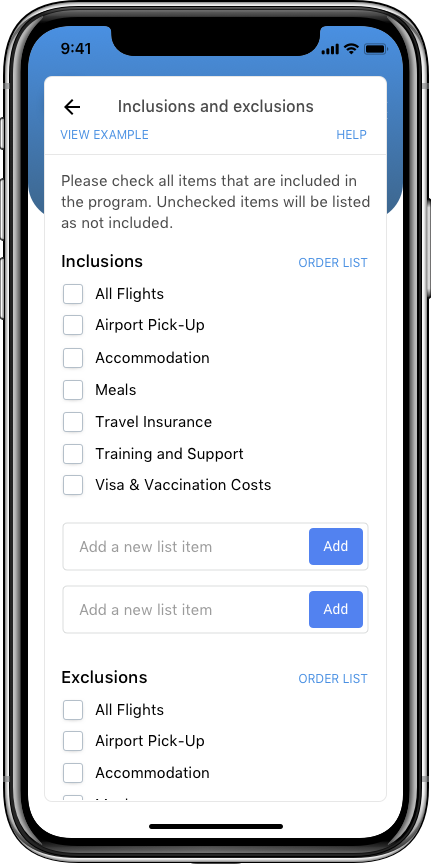
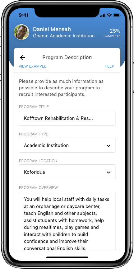
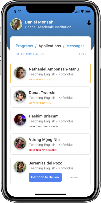
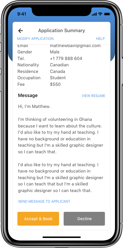
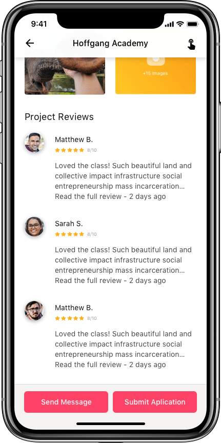
After prototyping, I gave my visual mock-ups one final pass to refine and clean up designs. My initial design layouts were very web-influenced but I feel the changes made during prototyping give the product a more native mobile app feel.
Click ON EACH SCREEN to view at full size
CURREN T STATE
Next steps...
The next step for this project is to user testing the prototypes and to start documenting the first draft of a style guide. This would also be an appropriate time to start working on the responsive web version of the product.
Key learning from this project was that building a prototype early in the design process can have the benefit of clarifying interaction design at an earlier stage which in turn can drive changes to the visual layout. In the future, it would be advantageous to build prototypes early in the product's design process.
Projects