Platform
Website
Skill Set
UX / UI Design
Company
uVolunteer
Year
2019
The Brief
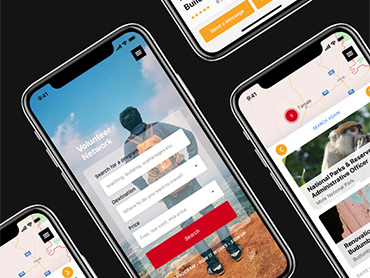
uVolunteer provides short-term volunteer abroad placements in Costa Rica, Ghana and Thailand to students and young professional in projects areas such as teaching, healthcare, conservation, community, sports and childcare.
The organization needed a website update to freshen its visual design and to fix some of the problems the site was having. uVolunteer's website was originally designed with a top-down hierarchy structure from the homepage down to the destinations and project pages making the user flow very easy. However, the organization receives a lot of requests for information that is already available on the site.
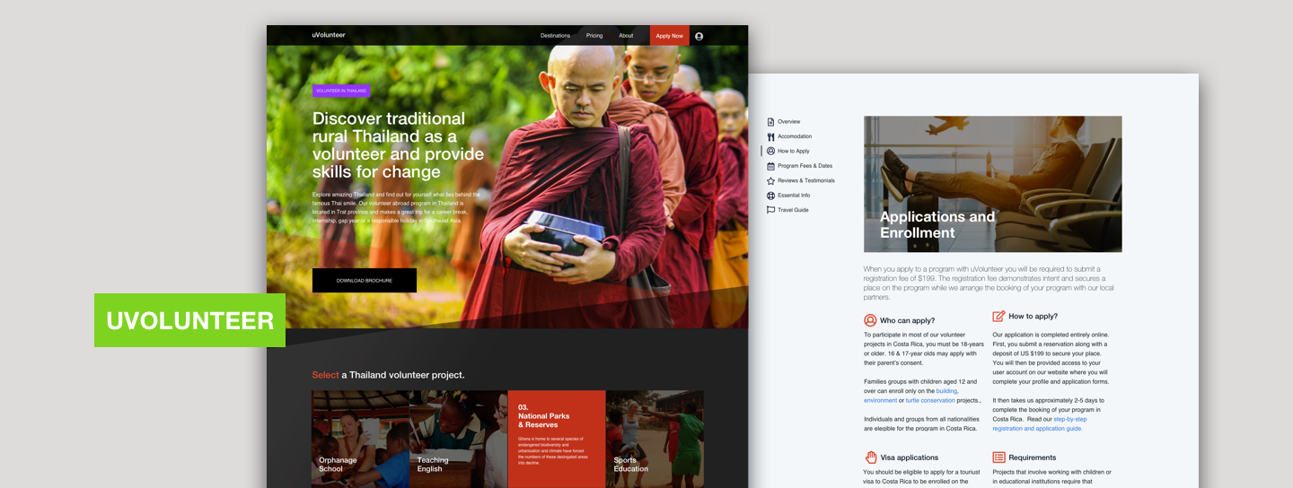
I was tasked to give a modern look to the website and to specifically look into why users request information that is readily available on the site, and to propose solutions to solve this problem.
The Process
01. Research
02. Defining the problem
03. Defining the solution
04. Visual design
05. Prototyping
01. Research
Getting started
I have worked for uVolunteer for several years and I considered myself very familiar with the organization, its product and the industry. I started this project by reviewing the data, by looking under the hood at our analytics, looking specifically at the behaviour flow, site content drill-down and top landing pages. I then sifted through and organized all the contact forms entries, specifically the ones that requested information that was already available online.
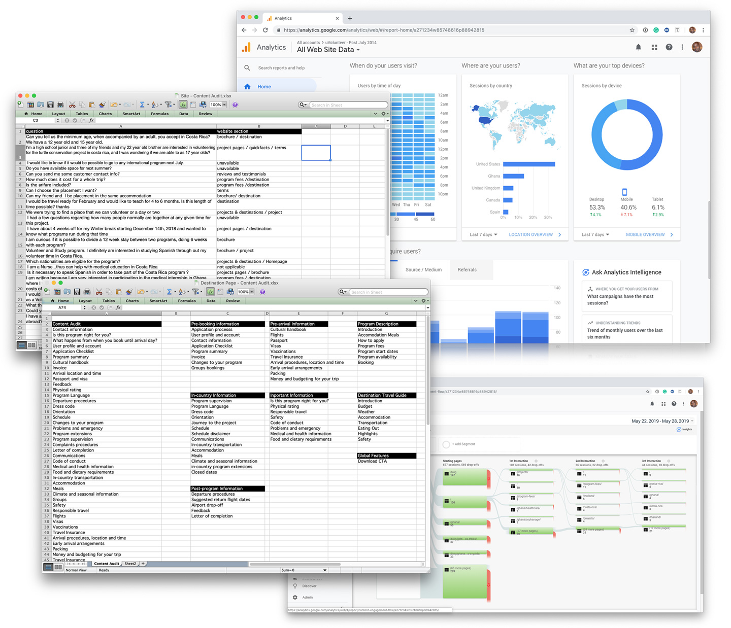
Data research
Findings from my quantitative research:
- The homepage was the top-landing page
- The majority of visitors to the homepage were 1st timers arriving from industry hubs and search results listings
- Users spent very little time on the homepage and immediately clicked through to the destinations and project pages.
- The destination pages are the most used pages for most visitors and they act as a central hub for navigation with users jumping back and forth from the destination pages to the other sections of the website.
Taking into consideration this data, I assumed that visitors to the website probably know the destination they want to visit before they arrive, but these were all assumptions. Quantitative methods provide clear data but cannot always answer "why" things happen.
Understanding the user
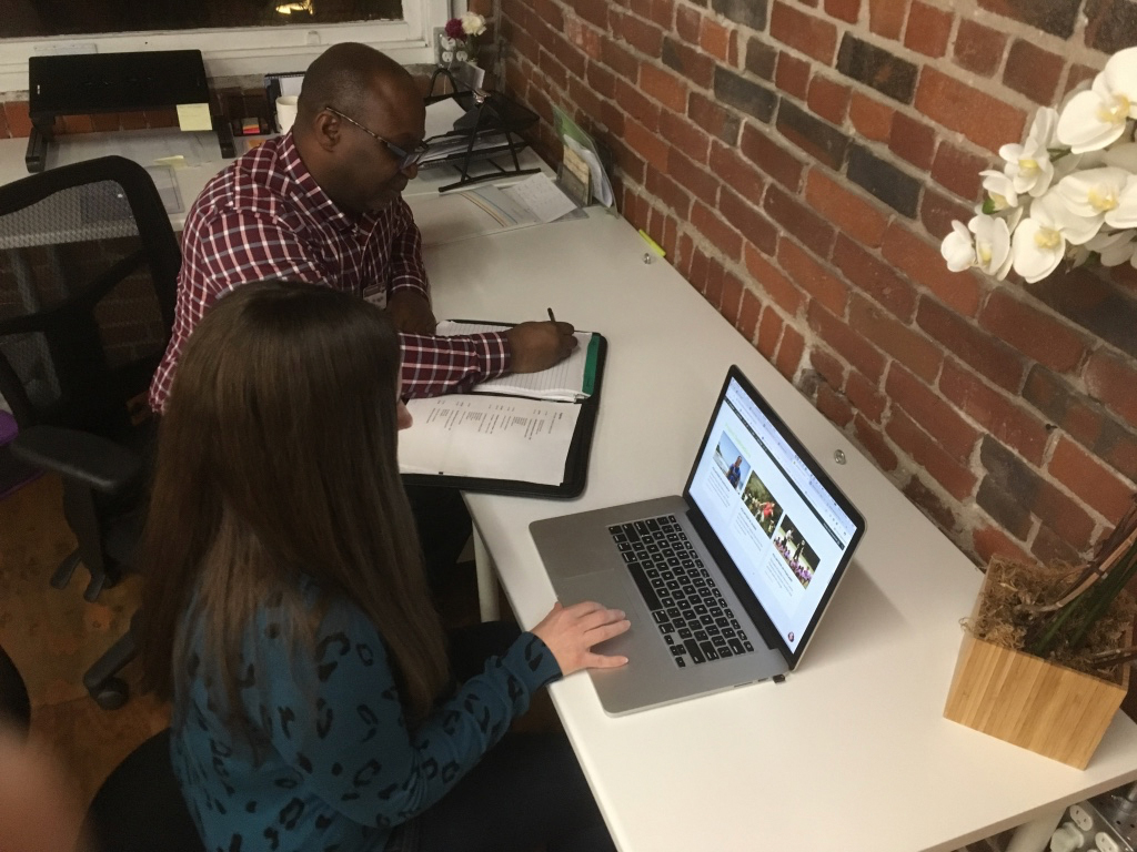
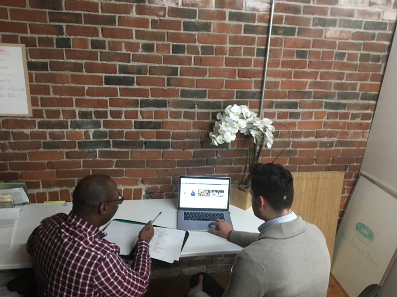
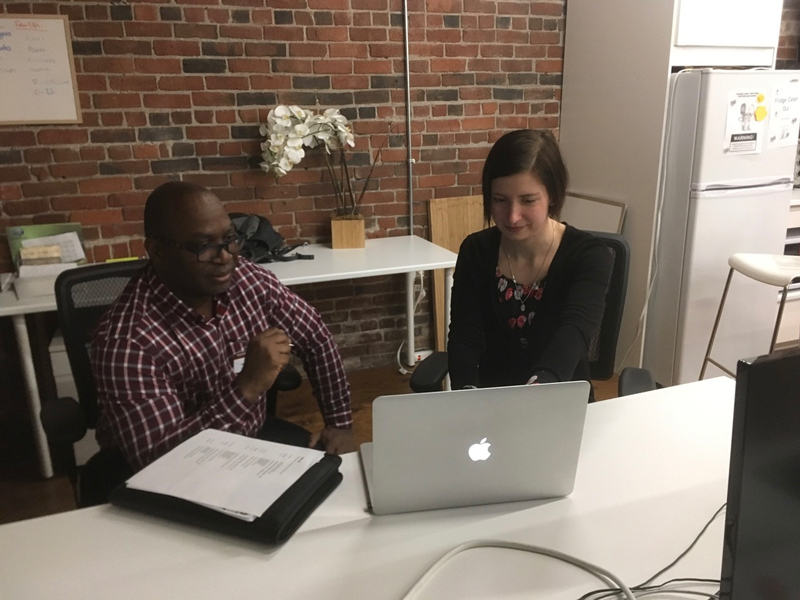
To go more deeply into the user's behaviour, I bootstrapped and arranged for three alumni to sit down with me and use the website so that I could observe their interactions with the site.
The tests were set-up to:
- Observe how users naturally navigate the website without direction.
- Provide goal-orientated tasks and observe how users navigated the site to complete the assignment.
I was trying to answer three main questions:
- Do users use the contact form because they just want to talk to a person behind the website, in other words - are they looking for trust?
- Can users not easily find the information they are looking for?
- How do users find the uVolunteer website in terms of easiness to navigate?
Findings from user testing
- Users found it generally easy to navigate the website.
- Users found similar information on different areas of the site and assumed that it was the same information duplicated.
- Users repeatedly used the global navigation (top banner) to jump to the different sections of the site. This was their main navigation menu.
Repeated quotes from users:
- All of the information about projects seemed to be repeated on different pages of the site.
- I did not realize there was so much information on this page, I just quickly scanned over this section but when you mentioned it I realised there is a lot of information here.
- How do I check the availability of programs?
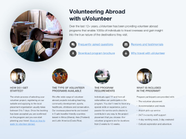
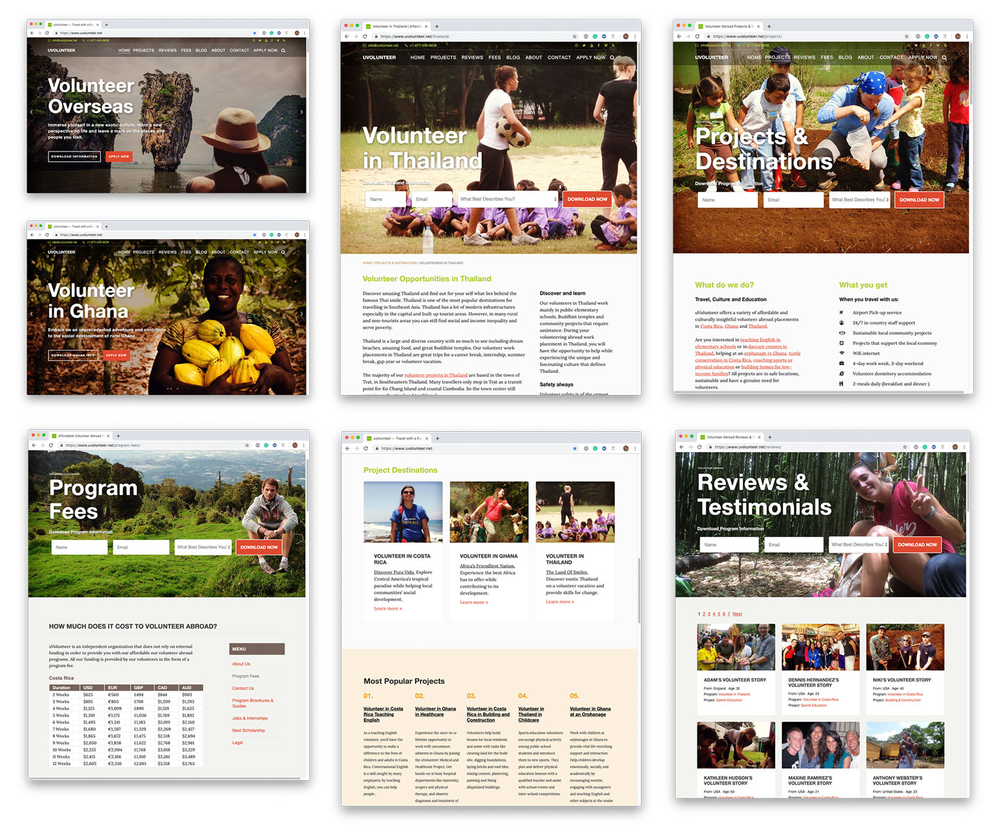
CURRENT WEBSITE
02.Problem
Defining the problem
Before jumping into the ideation process to define the problem statement based on user insight, I took into consideration the business requirements for the project.
Business goals
- To decrease the number of contact form submissions requesting information that was already available online.
- To decrease the load times of the website.
- To uplift the visual identity of the website.
User goals
- To avoid confusion and to find relevant information to decide on booking a volunteer program.
In other words -- the company wants to provide all essential information about the product on an up-to-date and fast downloading website so that prospects can purchase the product directly from the website, without having to first contact the organization to ask questions. On the other hand, the users' problems are more focused on the lack of knowledge.
I combined these two needs to defined the problem as:
Make users more confident in booking a program, by providing easily accessible information that answers all their pre-purchase questions
I further paraphrased this statement as:
Provide users with easily accessible information, in one central location, so that they are confident in booking a program directly online without having to first contact the organization
03. Solutions
Exploring solutions
From the research phase we know that:
- Users already decided the country they wanted to visit, and
- Users spent a lot of time jumping to and from destination pages.
We also know that projects in one destination can share similar information such as location, requirements, transportation, accommodation, meals, start dates, fees, etc. This similarity of content on different pages confused users. They believed it was the same content, when in fact it was similar but different.
Looking at the site’s structure it was obvious that the majority of the content is focused around destinations and projects.
Ultimately users are looking for destinations and projects in a specific destination.
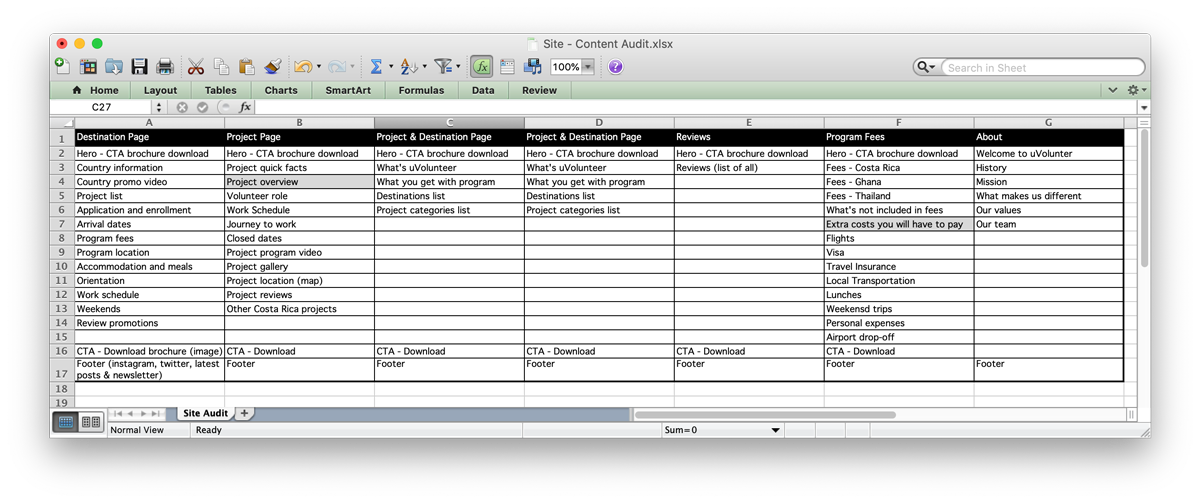
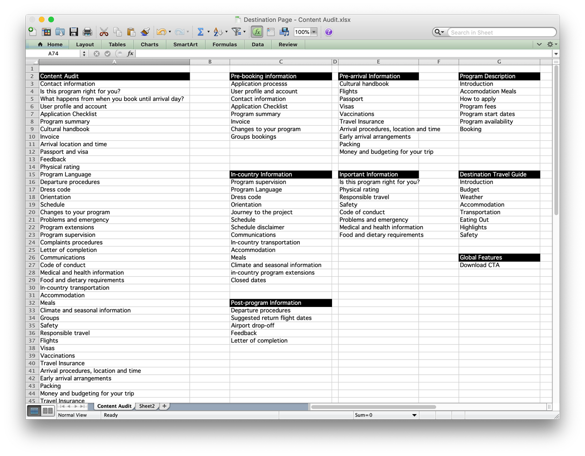
I conducted a content audit of the destination and project pages and affinity mapped similar content into groups and then made logical decisions on which page template the data should reside.
SITE - CONTENT AUDIT
DESTINATIONS - AFFINITY MAPPED
Keeping it simple
I knew from my initial research that users move around the site using the destination page as a central hub.
I also knew from historical data that the product has a very long sales cycle (6 weeks to 9 months).
This is understandable considering the product is a vacation product and airfares are generally cheaper the earlier they are purchased. In addition, the product’s primary customer segment (18-23 female student/graduate on the long break from university or extended leave) is fairly budget-conscious and the program is probably their first major solo trip abroad. This means that our product can be a scary undertaking and thus a lot of time is needed to research a program before a decision of purchase is made.
Considering the AIDA marketing model, I assumed users were making their way down the sales funnel and were visiting the site at different intervals (during the sale cycle) for different types of information. I decided to incorporate this model into the information architecture of the redesign.
Attention
Initial visits. The user quickly scans around to see what destinations and projects are available.
Pages: Destination overview, project page and program fees.
Interest
User is trying to find more detailed information about the organization, destinations and projects.
Pages: About us, brochures and FAQs.
Desire
A deep dive into all the sections to the site to find out as much as possible before a decision is made.
Pages: Essential information and travel guide.
Action
Information required to make a booking, planning and logistics.
Pages: Essential Information, application and booking procedures.
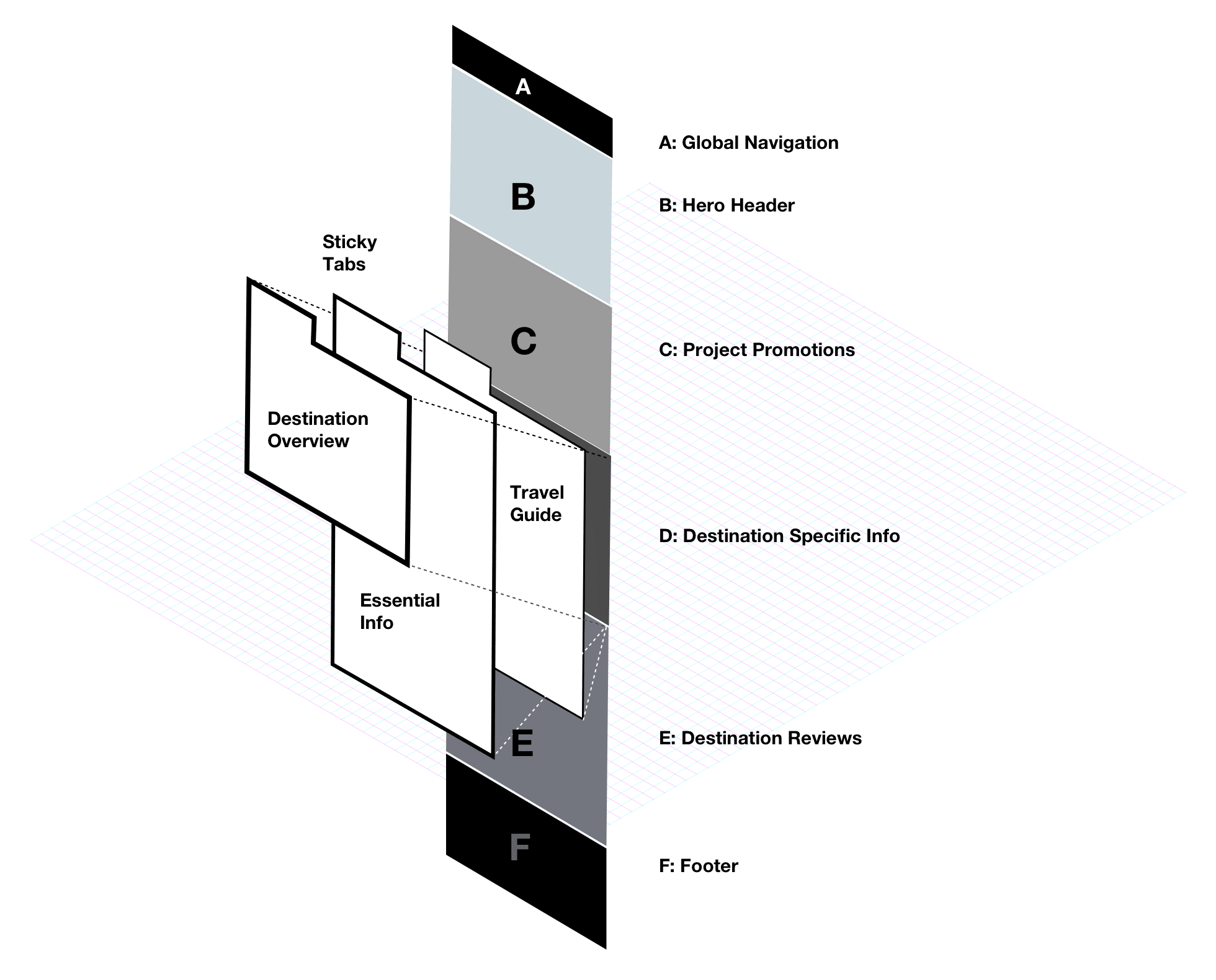
DESTINATION TEMPLATE - SECTION BREAKDOWN
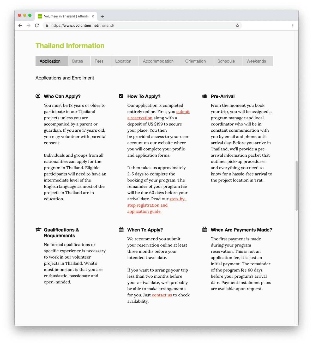
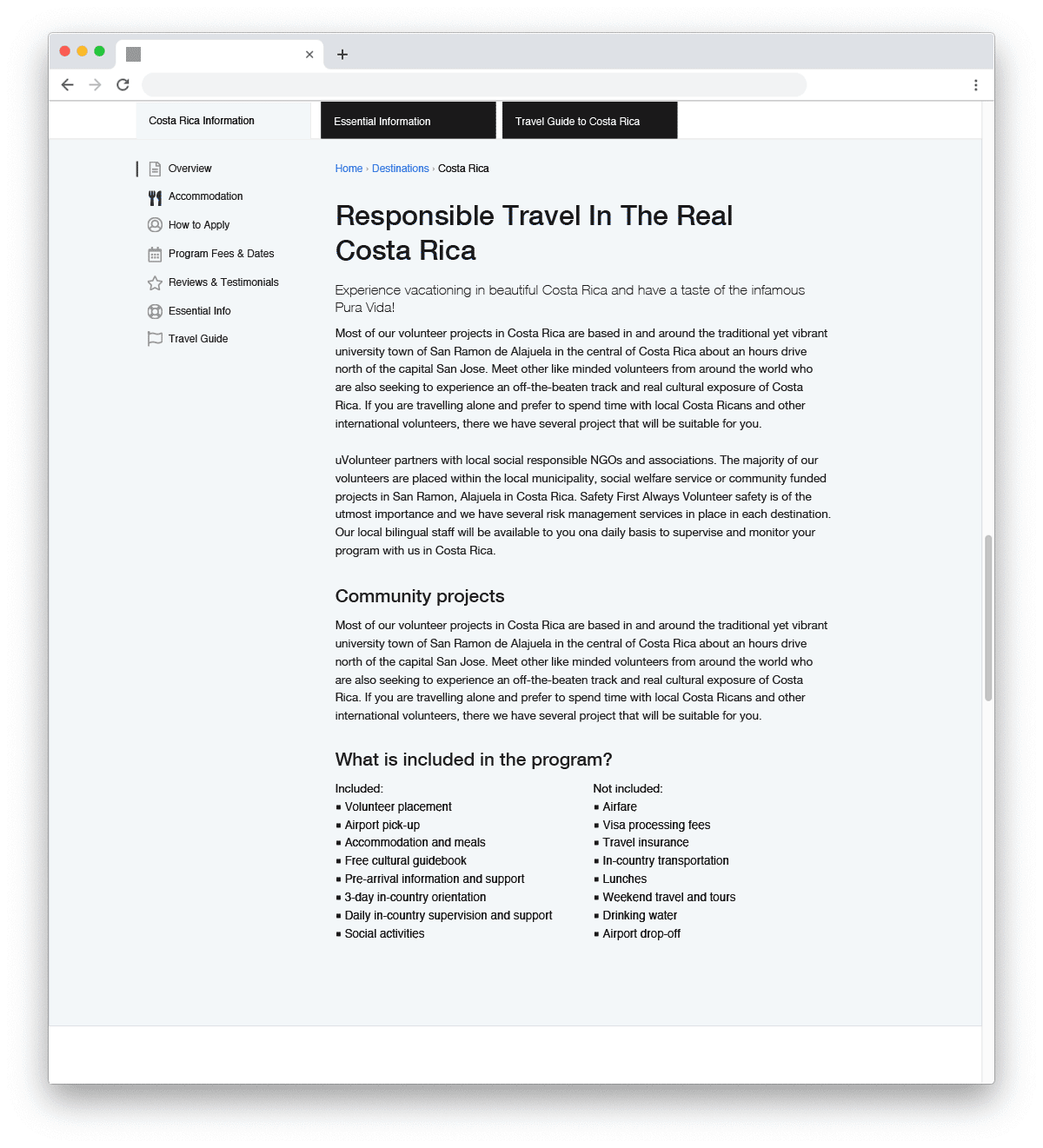
The current destination page layout used a tabular pattern to organize the destination-specific information. However, I observed from testing that users tended to quickly scan over this section of the page and missed all the information.
CURRENT - DESTINATION INFO TABS
I proposed to solve this problem by:
- Reducing the number of tabs using the groupings from our affinity map,
- Freezing the tab-pane once it reached the top of the page so that it was always available to focus users on this section, and
- Creating a list of navigation items on each tab that clearly illustrated the information available.
By making the tabs visually very obvious and by freezing this section of the page I was able to direct the users' attention on the destination-specific information in a way that would not be easily missed.
PROPOSED - DESTINATION INFO LAYOUT
Simplifying the navigation
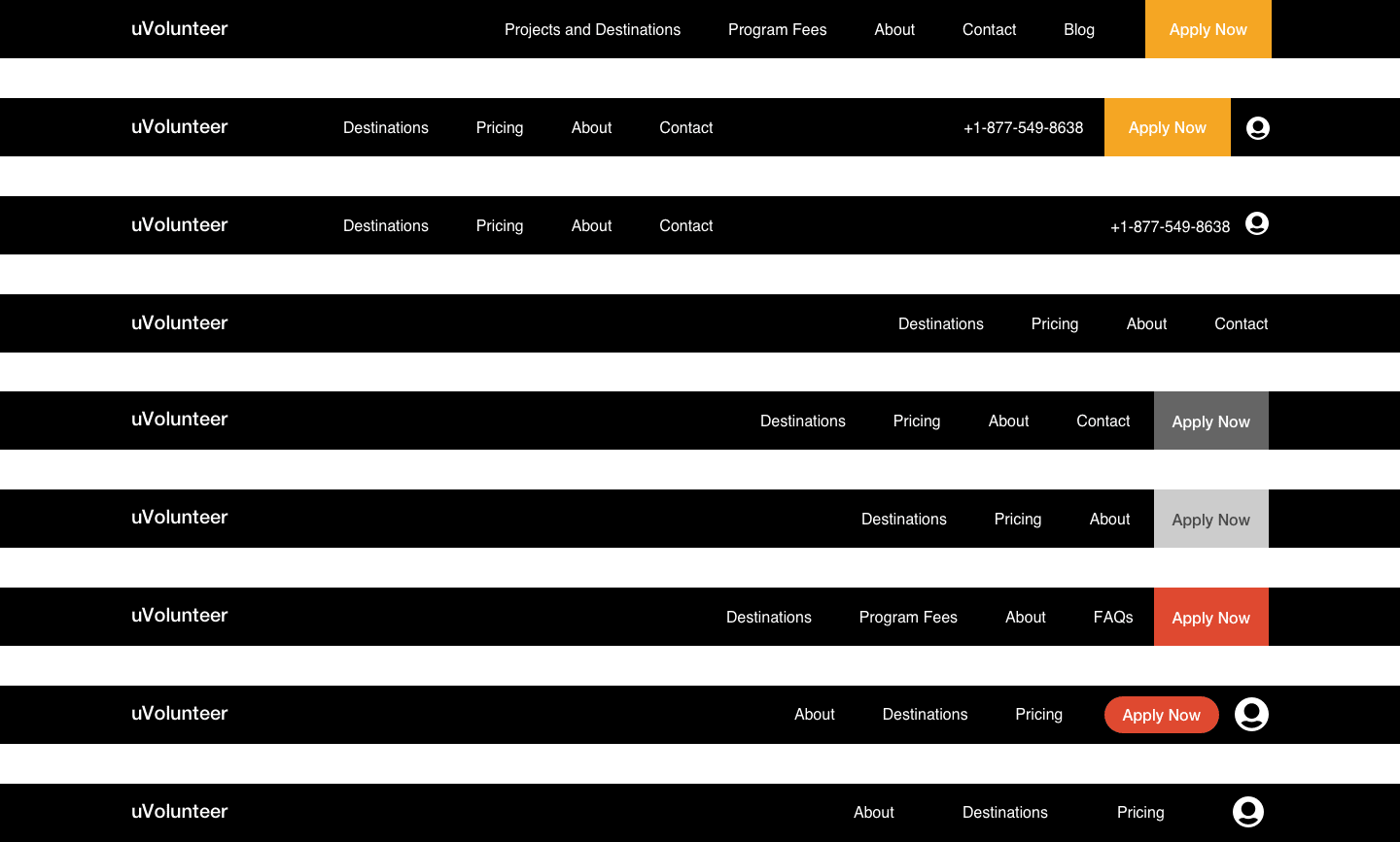
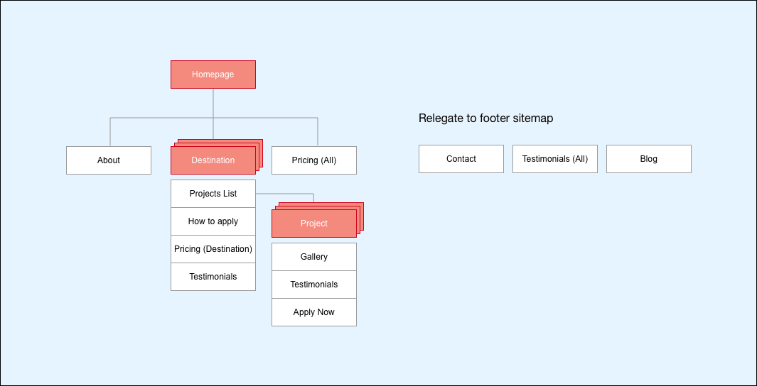
To further focus attention on the destination page as the central hub and the project pages as the spokes, and taking into consideration Hick’s Law I decided to simplify the global navigation items. I relegated menu items that detracted from our intended focus of destinations and projects. I then created a new menu in the footer for these relegated menu items.
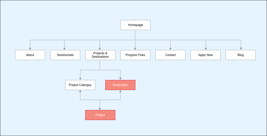
As part of the simplifying process, I also decided to combine the 'Homepage' and the 'Projects & Destination' page into a new page because these pages contained more or less the same information. By doing so, I could move the content one level up to a new homepage design and, as a result, I could further simplify the menu by removing another item.
During affinity mapping of the content audit, menu items such as (Testimonials & Apply Now) were grouped with their respective projects. In hindsight, the project page was in effect similar to a product page on a conventional e-commerce site. Thus, it was logical that the purchase 'call to action' and product reviews should be on this page. Therefore, I also removed these two links from the global navigation.
CURRENT SITE MAP
PROPOSED SITE MAP
Ideation by wireframing
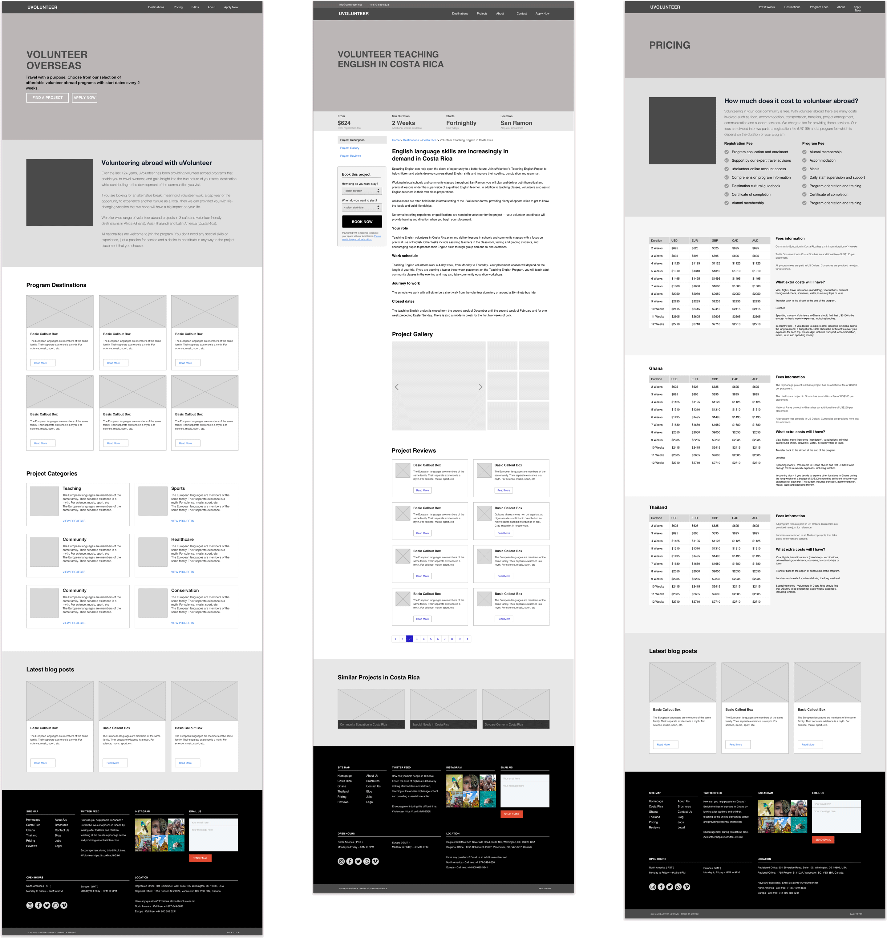
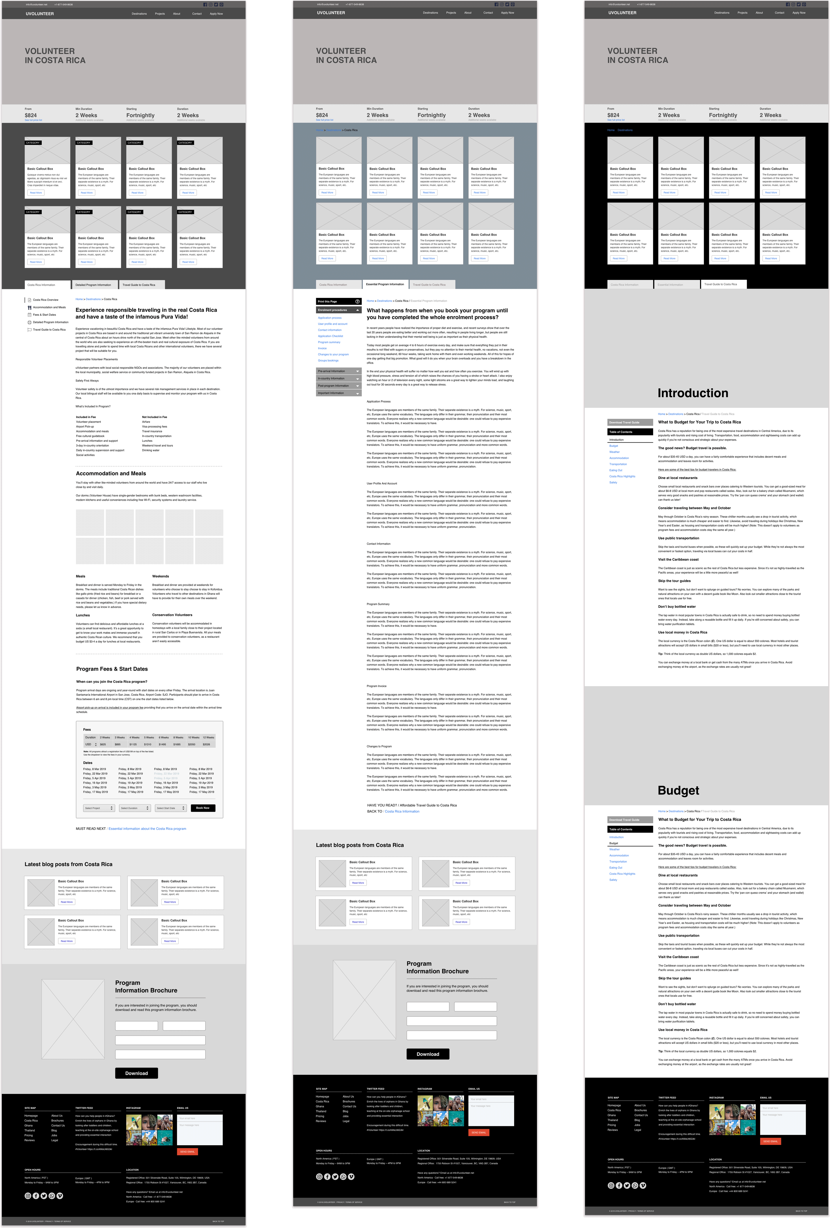
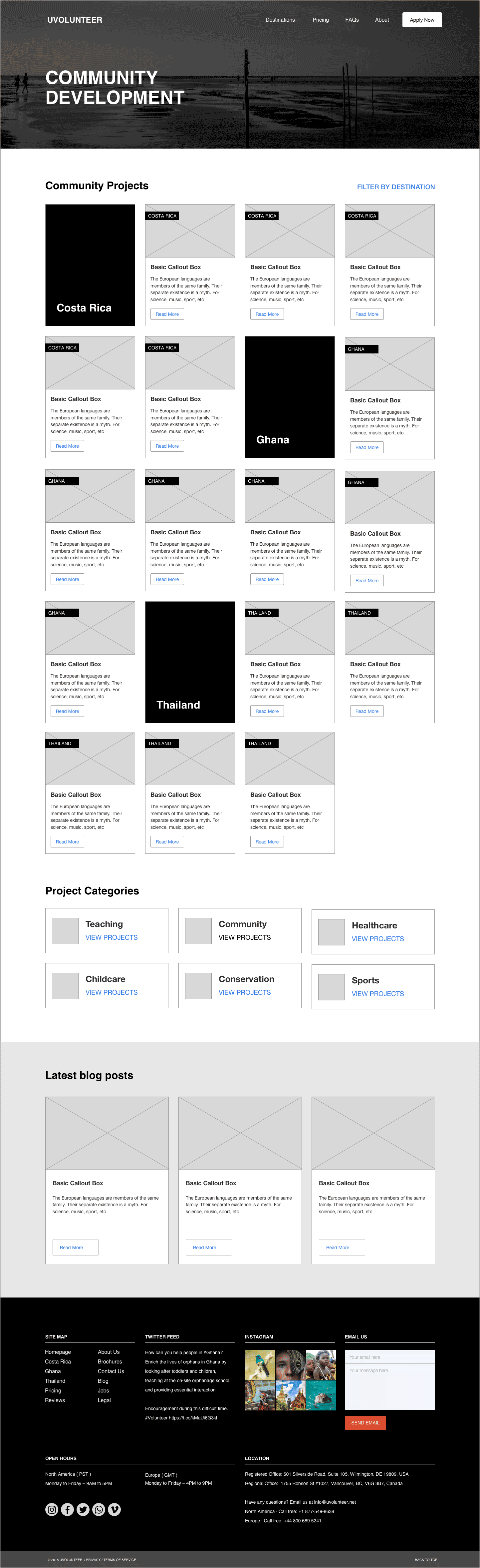
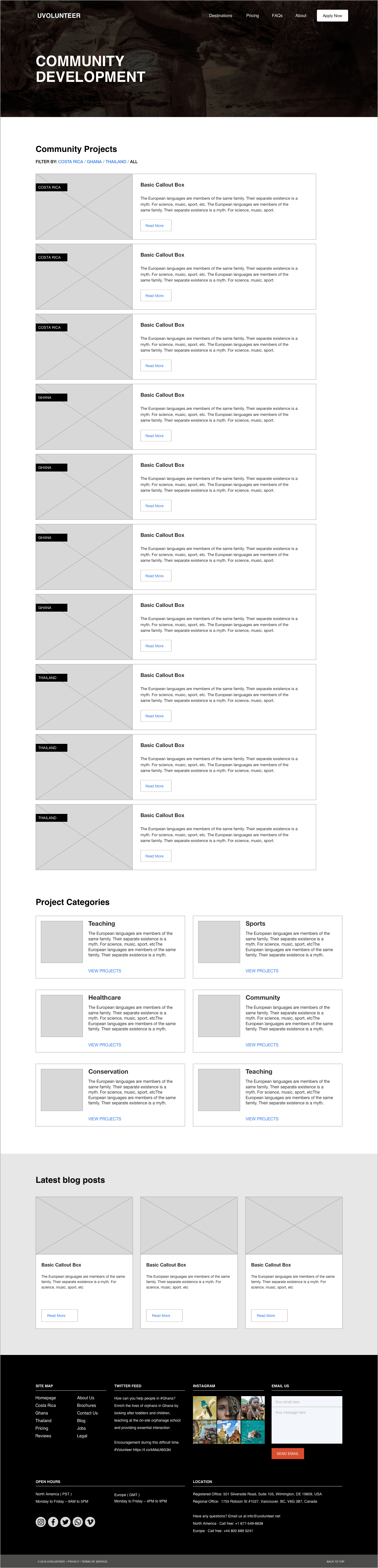
At this point in the exploration phase, I started to wireframe my initial ideas iterating through the solutions I had in mind. During wireframing I focused mainly on the layout of information, I make decisions on which design pattern to use to best present information to the user depending considering the presentation device. For this project, I simultaneously created both mobile and large-screen versions of the wireframes.
DESKTOP WIREFRAMES
SMALL DEVICE WIREFRAMES

Staying in flux
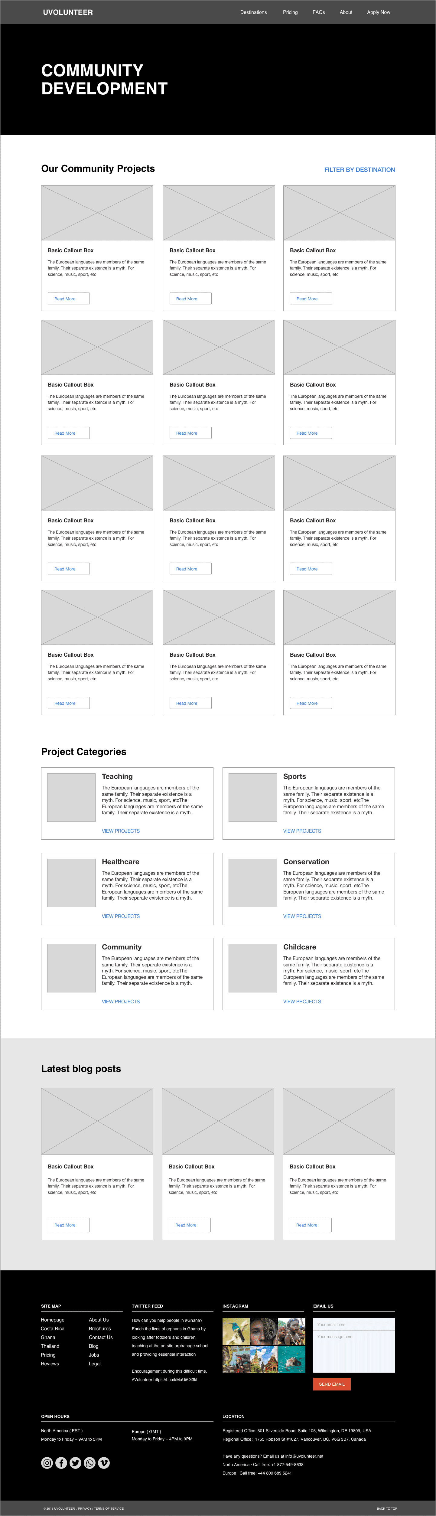
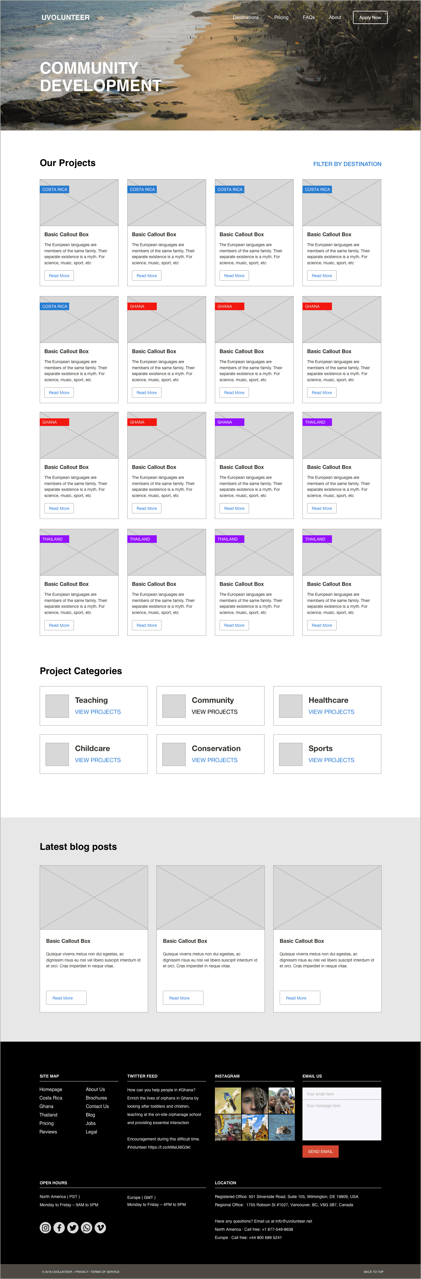
I worked with low-resolution wireframes for this project. However, as you can see from the samples below, I also concentrated on specific sections, for example, a header or footer and increase the wireframes' resolution of that area of the layout. This type of treatment is usually applied to sections of the template that I think will not change much or that I need to view as a visual mock-up.
During wireframing, I try to keep the page layouts in a continuously in a state of flux. Although I worked-up certain areas, in general, I try not to pay much attention to being pixel perfect, as I was more concerned with speed and getting a quick feel for the layout of content.
The non-Linear process
Early during the wireframing process, it became obvious that the tabular design pattern I proposed worked well on large screens but I had difficulty in determining by my wireframes if this layout would work well on smaller screens. This design pattern was so central to my proposed solution, to solve the problem of missed content, that I decided to quickly build a low-res prototype to better understand and test the interface's interactivity early in the exploration stage.
I was particularly interested in examining the responsiveness of the tab pattern for the destination-specific information section and how this information would be reformated on varying small screen sizes.
I had previously used prototyping tools such as FramerX, Principle, Figma and Proto.io, but I was not convinced whether any of these were the right tool for this project.
Eventually, I decided that for this project it would be best to build a real low-resolution prototype, not a simulation
...I wanted to observe the responsive nature of browsers of different sizes, not a native mobile device.
I finally decided on using Bootstrap 4, ( a new tool for me at the time), to build the prototype. I had experience using Bootstrap 3, and I had recently finished a project that relied heavily on CSS Grid Layout, Flexbox and SASS so I was confident that I could quickly pick-up the new changes to the BS4 framework. I figured that the benefits of a little learning on the job would result in a working prototype that could later be used as a starting point for further development.
View online low-fidelity prototype.
03. Visuals
Mockups
Building the low-res prototype enabled me to quickly understand the interactivity and responsive layouts of the product. But I was still not completely convinced that this design pattern would be ideal for mobile devices. There were still several micro-interactions that needed a prototype at a higher resolution. I decided that I would tackle these issues after visualizing my page templates.
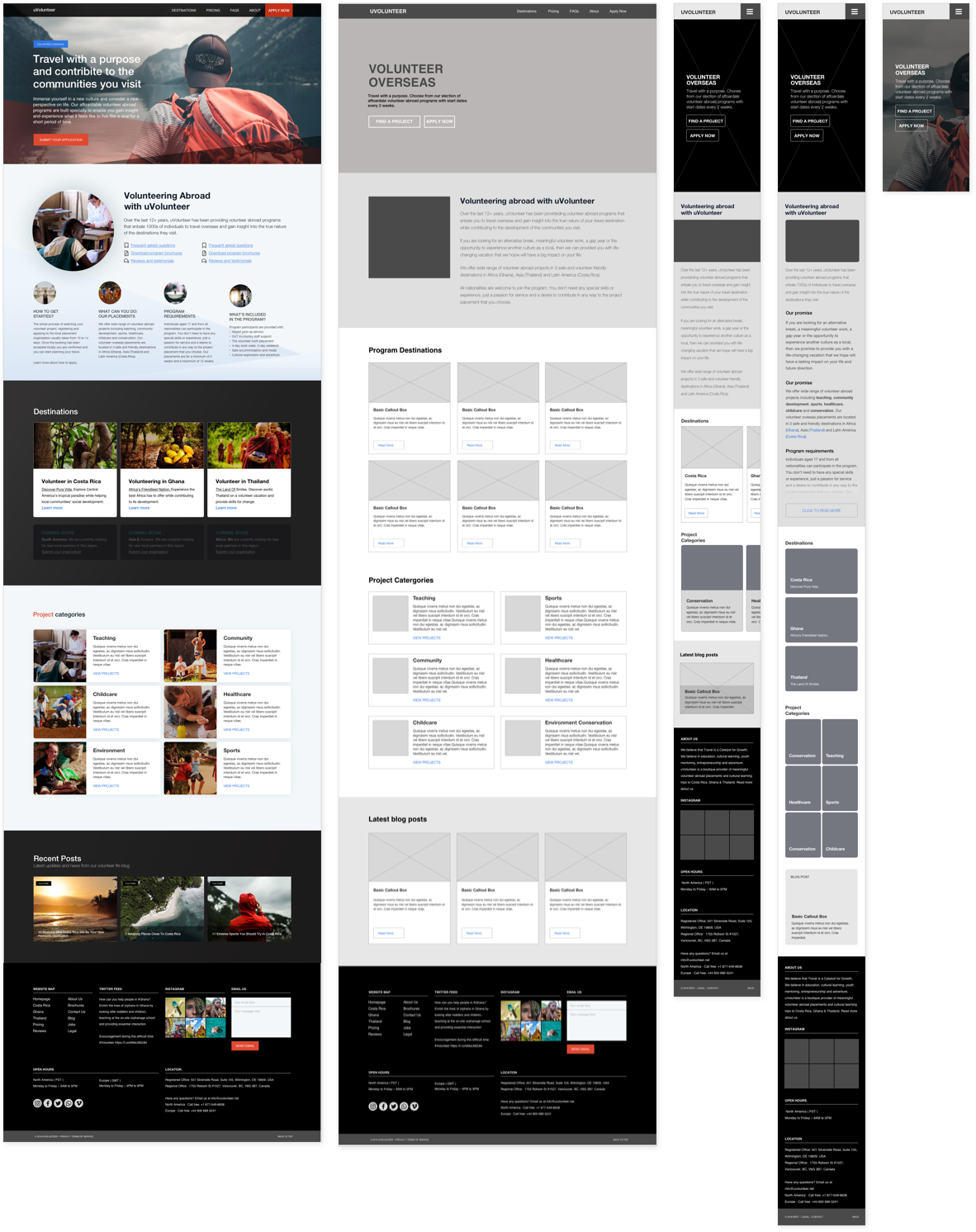
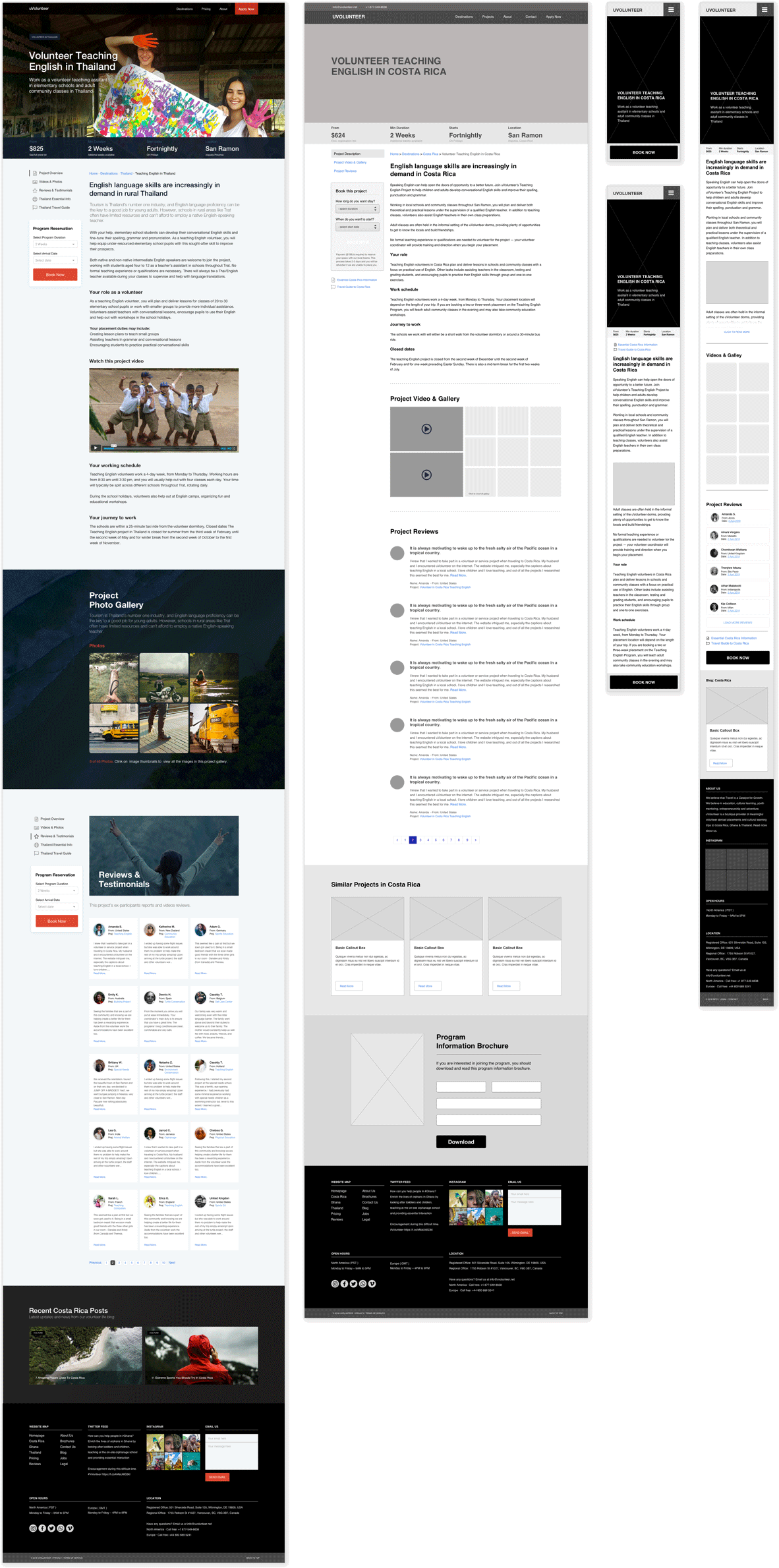
My process is to take each wireframe template and translate it into a visual mockup.
Iteration
After I created my first versions of visual mockups I decided to pay further attention to the homepage layout. I knew that this page was the primary landing page that acted as a gateway to destination and project pages, but, at the same time, it had to provide product and company information for users on secondary and subsequent visits.
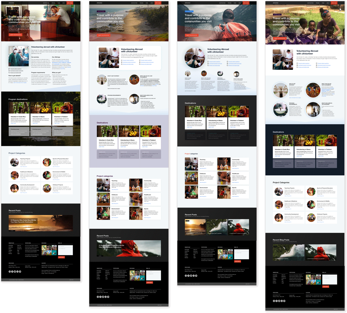
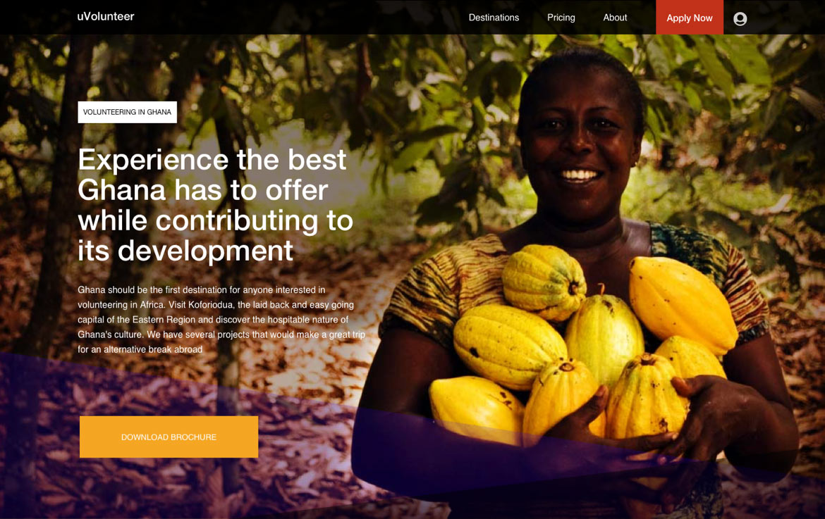
Hero header
Whilst working on the homepage I decided layout the hero section of the destination and projects pages. I treated this section of the template as if were a landing page and tried to highlight our primary 'call to action'.
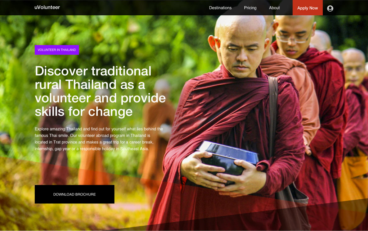
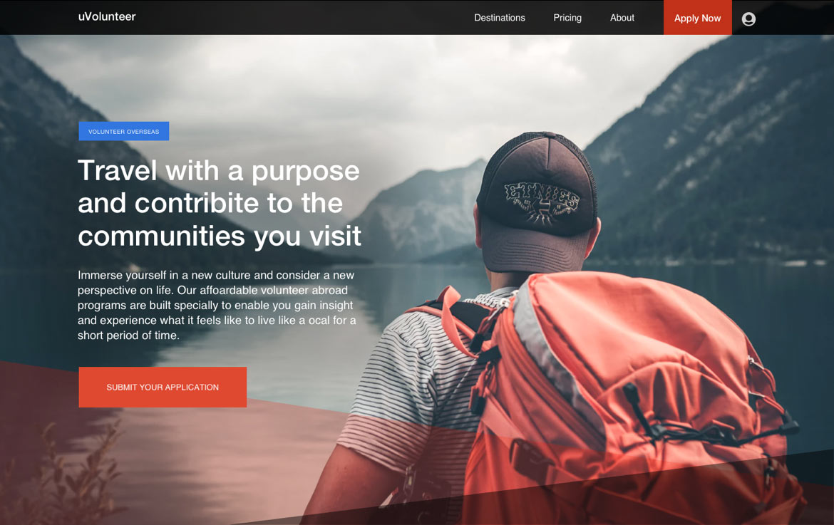
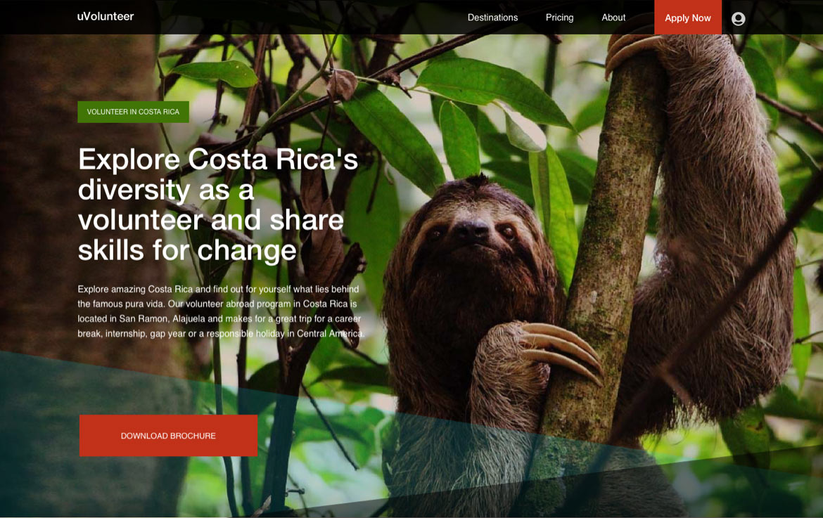
Responsive layouts
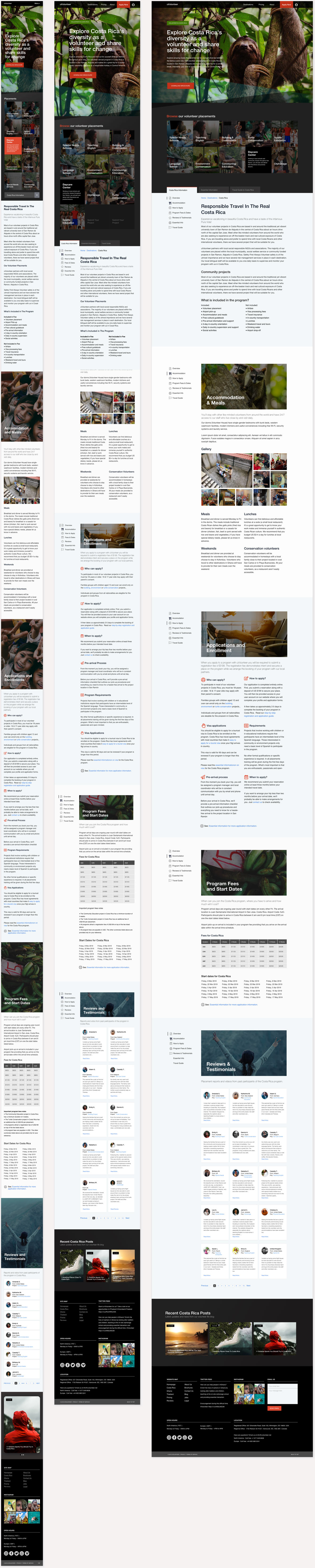
During the visual design phase, I also mocked-up each template at different screen sizes to get a general idea of information reflow and how best to treat the templates for effective responsive functionality.
Final templates
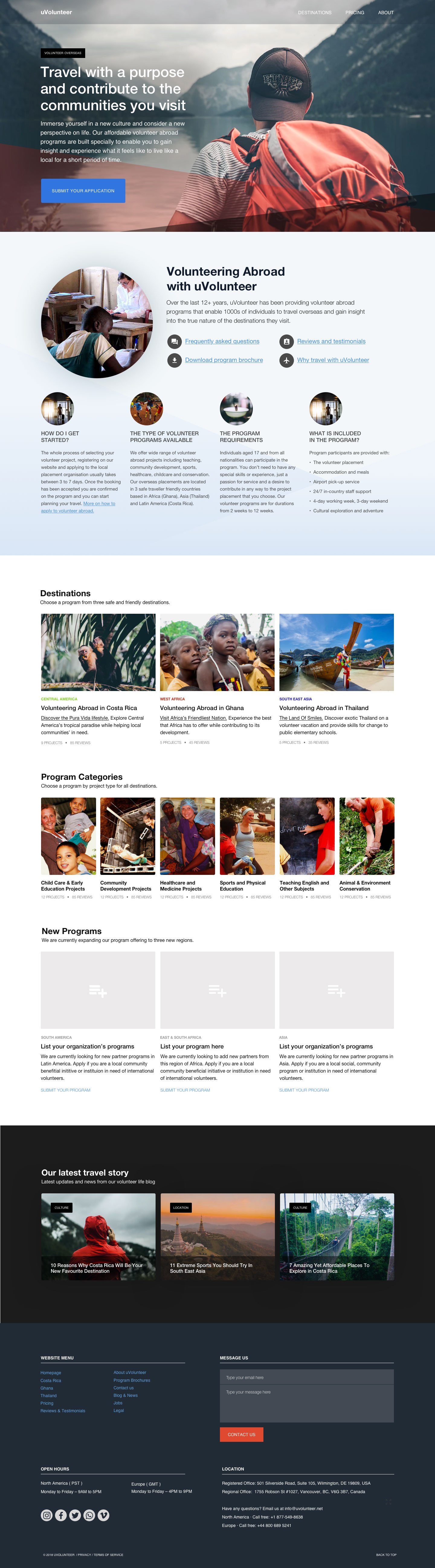
For this project, I did not produce visuals for every single page of the website. Instead, I delivered a set of page templates for the primary pages of the website. I then shifted my focus from visual design to documenting a style guide to help systemize the design.
For small website such as uVolunteer's, there is no need to build a full-blown design system. Nevertheless, I had been using a colour palette, typographic scales, icons, patterns and layout rules through the design process and creating a style guide enables me to pull these items out of my sketch files (mind!) into a sharable document.


State of play
Outcome
The new redesign was well received and perceived as a positive update to the current site. The next steps of the project is to build a real prototype, to user test it, to refine the design with the feedback and to set-up A/B testing on the redesigned website.
Projects